Inequality in Australia 2023: Overview
Inequality in Australia 2023: Overview is the latest in the Inequality in Australia series from the Poverty and Inequality Partnership led by ACOSS and UNSW Sydney. It is the 21st report published by the Partnership.
The report analysis includes the period following the COVID-induced recession, a time of unprecedented challenges and extraordinary policy responses. It highlights the very direct effect of government policy on inequality trends throughout the pandemic and explores the complex interplay of income support and taxation measures and their impact on household incomes.
The report looks at the changing distribution of wealth in our community over the last two decades and highlights the role of housing, taxation and superannuation policy in the growing divide.
We wish to extend our sincere gratitude to the organisations that have supported this partnership. The support of 54 reasons (part of the Save the Children Australia Group), ARACY, cohealth (a Victorian community health service), Foodbank Australia, Jesuit Social Services, Life Without Barriers, Mission Australia, SSI, and The Smith Family has been instrumental in empowering our pursuit of social justice. Furthermore, we are deeply appreciative of the backing provided by philanthropic partners Hart-line and the Social Justice Fund, both of which are part of the Australian Communities Foundation, along with the invaluable support of John Mitchell.
Our sincere thanks to UNSW President and Vice-Chancellor Professor Attila Brungs for his support of the Partnership’s work, along with the ACOSS Board and Emeritus Professor Eileen Baldry.
Cassandra Goldie, CEO, ACOSS & Carla Treloar, Director, Social Policy Research Centre, UNSW Sydney
Income inequality
- In 2019-20, the highest 20% of households by income had average incomes of $4,306 per week after tax, five times the income of the lowest 20%, and the highest 5% had eight times the income of the lowest 20%.
- Wages comprise 77% of incomes overall, but the lowest 20% relied relatively more on social security (50% of their income) while the highest 5% relied relatively more on investments (comprising 23% of their income).
Long-term trends in income inequality (1999 to 2019)
- Over the last two decades, income inequality increased during periods of income growth (1999-2007) and stabilised in periods of income stagnation (2007-2019).
- The average incomes of the highest 5% grew faster (by 59% overall) than those of the middle 20% (41%) and lowest 20% (46%) during this period.
Impact of COVID-19 (2019 to 2022)
- During the first year of recovery from the COVID recession (2020-21), temporary government income supports lifted average household incomes and reduced income inequality.
- COVID income supports helped the lowest 20% more significantly than other groups.
- However, the removal of COVID income supports during 2021-22 led to a decline in real incomes and an increase in income inequality, bringing it close to pre-COVID levels.
Wealth inequality
- Average household wealth in Australia is the fourth highest in the world, driven mainly by home ownership.
- Wealth distribution is highly unequal, with the wealthiest 20% holding average wealth of $3,240,000 – six times the wealth of the middle 20% and 90 times that of the lowest 20%.
- Contrary to the image of the ‘mum and dad investor’, the highest 20% by wealth holds 82% of the value of all investment property and 78% of all shares and financial investments.
Long-term trends in wealth inequality (2003 to 2022)
- Wealth inequality increased substantially over the past two decades. The wealth of the highest 20% increased by 82% compared to 61% for the middle 20% and just 20% for the lowest 20%.
- Growth in superannuation assets contributed significantly to the overall increase in of wealth inequality.
There is widespread concern that a minority of wealthier households has prospered in recent decades while living standards stagnated for the majority. A recent Organisation for Economic Cooperation and Development (OECD) survey found that 69% of people in Australia agreed that ‘differences in income are too large’.1OECD 2021, Does inequality matter? Paris.
So it is refreshing to hear a federal Treasurer advocate ‘growth that puts equality and equal opportunity at the centre.’2Chalmers J (2022) Capitalism after the crises. The Monthly, February 2023. The government’s recently published wellbeing framework is a welcome attempt to shed light on whether we are making progress on that score. Regrettably it contains no data on poverty, but it does include a summary of trends in income and wealth inequality, using the Gini coefficient as an indicator3See Chapter 1 Measuring Inequality for an explanation of what this means and how our analysis compares. . It concludes that income inequality ‘remained relatively steady since 2007–08’ and wealth inequality also ‘remained steady’.4Australian Government (2023), Measuring What Matters Statement July 2023
Yet if we dig a little deeper, the inequality story is not so straightforward. The ‘steadiness’ of income and wealth inequality from 2007 to 2019 came off the back of a steep rise in inequality during the early 2000s, and income inequality was far from ‘steady’ after 2019 when COVID lockdowns and government income supports dramatically impacted household incomes.
Further, single measures of inequality such as the Gini coefficient do not tell us much about differences in income and wealth across the community including who has how much, and how wide the gaps are.
This report uses the best and latest available data from the Australian Bureau of Statistics to explore both how income and wealth are shared across the community and changes in income and wealth and their distribution since the COVID recession. We find that:
- In 2019-20 there was a wide gap between the lowest and those with the highest household incomes in Australia. The highest 20% (with average disposable income of $4,306 per week) had five times the income of the lowest 20% (with $794 per week). The highest 5% (with $6,495per week) had eight times the income of the lowest 20%.
- More recently, during the first year of recovery from the COVID recession (2020-21), COVID income supports (JobKeeper Payment and Coronavirus Supplement) helped lift average household incomes by $76 per week (after inflation), but over the following year (2021-22) they fell by $19 per week (despite falling unemployment) as those income supports were removed.
- During 2020-21, COVID income supports reduced income inequality. The average income of the lowest 20% grew by 5.3% compared with 2% for the middle 20% and 2.4% for the highest 20%.
- During 2021-22, the removal of COVID income supports largely reversed those trends, restoring income inequality close to its pre-COVID level. Incomes fell (after inflation) across the board, but more so for those with the least. The average income of the lowest 20% fell by 3.5% compared with 0.5% for the middle 20% and 0.1% for the highest 20%.
- Looking back over the last two decades, income inequality increased during periods of income growth (1999-2007) and stabilised in periods of income stagnation (2007-2019). That is, income growth was unequal but stagnation was widely shared. Over the whole period, the average incomes of the highest 5% pulled away from the rest, growing by an average of 2.9% a year compared with 2.1% for the middle 20% and 2.3% for the lowest 20%. Our reliance on private saving via home ownership and superannuation means that, at around $1.2 million, average wealth in Australia was the fourth-highest in the world in 2022 (after Switzerland, the United States and Hong Kong). However along with income, overall wealth declined during 2022 due to inflation and higher interest rates.
- Wealth is very unequally distributed. In 2019-20 the highest 20%, with average wealth of $3.2 million, had six times the wealth of the middle 20% ($588,000) and 90 times that of the lowest 20% (with just $36,000) and held almost two-thirds (64%) of all household wealth.
- Wealth inequality has increased strongly over the past two decades. From 2003 to 2022, the average wealth of the highest 20% rose by 82% and that of the highest 5% rose by 86%, leaving behind the middle 20% (with a 61% increase) and the lowest 20% (with a 20% increase).
In 2019-20, the highest 20% of households had five times the income of the lowest 20%
When we compare the average disposable incomes of the highest 20% of people ranked by household income after tax, we find a wide gulf between the $4,306 per week ($305,000 per year before tax) received by the highest 20% and the $794 per week ($43,000pa before tax) going to the lowest 20%.5Based on data from the ABS Survey of Income and Housing Confidential Unit Record files for 2019-20. The ranking is based on household disposable income adjusted for household size, the dollar amounts shown are unadjusted before-tax household income.
The highest 5% (with $6,495 per week) had eight times the income of the lowest 20%.
In 2019-20 income from investments and wages were strongly skewed towards high-income households, while the lowest 20% relied on social security for half of their income
Income gaps between high, middle and low-income households are due in part to the make-up of household incomes:
- The highest 20% received four-fifths (80%) of its income from wages (averaging $4,660 per week before tax) and 15% from investments (averaging $855 per week).
- The highest 20% received 43% of all wages (compared with 18% for the middle 20%) and 59% of all investment income (compared with 12% for the middle 20%).
- At the lower end of the scale, the lowest 20% relied on an average of $419 per week in social security payments for half (50%) of its income and $318per week in wages for another 38%.
- The middle 20% relied on wages averaging $1,860 per week for 80% of its income, investment incomes averaging $192 per week for 8% of its income, and social security payments averaging $205 per week for another 9%.
During the first year of recovery from the COVID recession (2020-21) real incomes rose and inequality declined due to COVID income supports
Between 2019-20 and 2020-21, average household disposable incomes rose (after inflation) by $76 per week, buoyed by COVID income supports (JobKeeper Payment and Coronavirus Supplement), even though unemployment rose and average paid working hours per person fell by 0.5% due to COVID lockdowns.6Analysis of recent trends from 2019-20 to 2021-22 uses different data (ABS Australian National Accounts Distribution of Household Income, Consumption and Wealth ) to the statistics cited here for 2019-20 and previous years. Compared to the ABS Survey of Income and Housing, in the ABS ANA statistics income is defined differently, and households are allocated differently across income and wealth distributions, to (e.g. income includes imputed rents from owner-occupied housing). See ‘Measuring Inequality’ below.
During this period income inequality declined:7The share of all household income received by the lowest 20% was 7.8% in 2019-20, rising to 7.9% in 2020-21. Equivalent figures for other income groups were 16.7% to 16.7% for the middle 20% and 41.8% to 41.2% for the highest 20%. Effective unemployment was a measure used by Treasury to include people still employed but laid off due to COVID. These figures are averages for each year – effective unemployment varied between 15% during the COVID recession in the last quarter of 2019-20 and 4% at the end of 2021-22
- The average income of the lowest 20% grew by 5.3% compared with 2% for the middle 20% and 2.4% for the highest 20%.
Government policies made a difference:
- On average, the lowest 20% gained an extra $41 per week in social security payments compared with $21 for the middle 20% and $4 for the highest 20%.
- Changes in tax levels had a lesser impact: on average the lowest 20% paid $1 per week less in tax, the middle 20% paid $6per week more and the highest 20% paid $1 per week more.
During the second year of recovery (2021-22) real incomes fell and inequality increased, due mainly to the withdrawal of COVID income supports
Between 2020-21 and 2021-22, average real household after-tax incomes fell by $19 per week under pressure from the removal of COVID income supports and (to a lesser extent) higher inflation, despite solid increases in overall paid working hours as the economy recovered.8Average paid working hours per capita rose by 2.4% in 2021-22.
Income inequality rose, restoring it to close to pre-COVID levels:9The share of all household income received by the lowest 20% was 7.6% in 2017-18, rising slightly to 7.7% in 2021-22. The equivalent figures for other income groups were 16.6% to 16.8% for the middle 20% and 41.8% to 41% for the highest 20%
- The average income of the lowest 20% fell by 3.5% (after inflation) compared with 0.5% for the middle 20% and 0.1% for the highest 20%.10A previous report in this series examined the impact of the COVID recession and income supports on income inequality during 2019-20 (Davidson P 2022, A tale of two pandemics: COVID, inequality and poverty in 2020 and 2021. ACOSS and UNSW Sydney).
Once again social security and tax changes played a significant role, reversing their impact over the previous year. On average during 2021-22:
- The lowest 20% of households lost $43 per week in social security payments compared with $22 for the middle 20% and $5 for the highest 20%;
- Income tax payments increased due to ‘bracket creep’ as employment recovered and inflation rose. The lowest 20% paid $1 per week more income tax, the middle 20% paid $12 per week more and the highest 20% paid $98 per week more.
- However, this rise in tax for people with high incomes will be more than reversed if the ‘Stage 3’ tax cuts go ahead in 2024. Individuals with incomes of $200,000 or more would save $175 per week in income tax.11Phillips et al estimated in 2020 that the Stage 3 tax cuts more than offset tax bracket creep from 2018 to 2024 for the highest 20% of households by income, though at that time estimates of inflation were much lower (Phillips B, Gray M, & Webster B 2020, Modelling Coalition Personal Income Tax Policies 2017 to 2029. ANU Centre for Social Research and Methods. Canberra). 12 Davidson P, Bradbury B, & Wong M (2020), Poverty in
Taking the longer view, over the last 20 years income inequality grew during periods of strong income growth and flattened out during periods of income stagnation
During the boom years between 1999 and 2007 (just before Global Financial Crisis or ‘GFC’), household after-tax incomes in Australia grew strongly overall, but so did income inequality. While all income groups had solid income growth on average, growth was skewed towards the highest 20%:
- The average household income (after tax) of the highest 20% rose by 5% a year after inflation, compared with 4% for the middle 20% and 3.9% for the lowest.
- At the very lowest end of the scale, many people on ‘allowance’ payments such as Newstart (now called ‘JobSeeker’) saw no growth in their incomes at all.12Davidson P, Bradbury B, & Wong M (2020), Poverty in Australia – who is affected? ACOSS and UNSW Sydney At the upper end of the scale, the average income of the highest 5% of households rose by 7.4% a year.
This pattern changed after the GFC in 2008, when incomes stagnated across the board:
- Compared to overall average growth of 4.3% a year during the boom, growth in household incomes after inflation fell to a meagre 0.6% per year from 2007 to 2019.
- Most groups shared in the stagnation. The incomes of the highest 20% rose on average by 0.6% per year, compared with 0.5% for the middle 20% and 1% for the lowest 20% (the latter aided by a substantial increase in pensions in 2009).
Over the period as a whole, average annual income growth after inflation was 2.3% for the highest 20%, compared with 2.1% for the middle 20% and 2.3% for the lowest 20%. The highest 5% fared best, with annual income growth averaging 2.9%.
Average household wealth in Australia is $1.2 million – the fourth highest in the world -though it declined in 2022 under pressure from inflation and higher interest rates
Average wealth (financial and other assets) in Australian dollars per household was $1,177,000 in 2022 (a $92,000 reduction from the 2021 level). Average wealth per adult in Australia is fourth highest in the world, after Switzerland, the United States and Hong Kong.13UBS Bank (2023) Global wealth report. Geneva. This reflects the Australian reliance on private saving via home ownership and superannuation and the absence of a generous public pension.
In 2019 wealth was very unequally distributed with the wealthiest 20% holding more than 90 times the wealth of the lowest 20%
The high average wealth figure doesn’t mean we’re all millionaires now. Wealth is much more concentrated towards the top than incomes. In 2019, the wealthiest 20% (with an average of $3.2 million) had six times the average wealth of the middle 20% (with $588,000) and 90 times that of the lowest 20% ($36,000) and held almost two-thirds (63%) of all wealth. The wealthiest 5% (with an average of $6.7 million) held almost one third of all wealth (32%).14The 2019 figures are derived from the latest ABS Income and Housing Survey. Distributional data from that survey are likely to be more reliable than the more recent figures available from the ABS Australian National Accounts household distribution data from which we derive the $1,177,000 estimate for average wealth in 2022.
Much of our wealth is tied up in property. In 2019 half (50%) of household wealth was held in real estate (38% in the main home and 12% in investment properties), compared with 42% in financial investments (22% in superannuation and 20% in shares and other financial investments), and 9% in other non-financial assets such as cars.
Ownership of investment property and financial investments such as shares are heavily skewed to the wealthiest households
Contrary to the media image of the typical ‘mum and dad investor’, the wealthiest 20% owned 82% of all investment property (with average holdings of $266,000 including those without investment property). They owned 78% of all shares and other financial investments, with an average value of $563,000. These forms of wealth deliver substantial capital gains each year to individuals with the highest incomes. In 2019, $29 billion in taxable capital gains (84% of all taxable capital gains) were received by the highest 20% of individual taxpayers by income.15Australian Taxation Office (2021), Taxation statistics, Table 16. The highest 20% had taxable incomes over $104,000. This report includes high-level analysis of wealth distribution across households ranked by income.
Ownership of our largest assets by value – superannuation and owner-occupied housing – was somewhat less concentrated. The wealthiest 20% held 59% and 55% of those assets respectively.
From 2003 to 2022, the average wealth of the highest 20% grew one third faster than that of the middle 20% and four times faster than the lowest 20%
Since wealth begets more wealth, wealth inequality rises more persistently than inequality of income.16Picketty T (2017), Capital in the 21st century. Harvard University Press. Boston.
Wealth grew strongly and unequally from 2003 through to 2022 apart from short pauses around the Global Financial Crisis, the COVID recession, and over the last 12 months:
- Average household wealth (in 2019 dollars) rose from $676,000 in 2003-04 to $1,056,000 in 2017-18, fell to $1,037,000 during the COVID recession in 2019-20, rose very sharply to $1,269,000 in the recovery in 2021-22, then fell back to $1,177,000 in 2022 under pressure from inflation and interest rate rises.
- Rises and falls in owner-occupied housing wealth dominated the recovery in wealth from the COVID recession.17Davidson P & Bradbury B (2022), The wealth inequality pandemic: COVID and wealth inequality. ACOSS/UNSW Sydney.
- From 2003 to 2022, the average wealth of the highest 20% grew one third faster (by 82%) than that of the middle 20% (61%), and four times faster than that of the lowest 20% (which grew by just 20%). The average wealth of the wealthiest 5% rose by 86%.
The largest contributor to the overall increase in wealth inequality over this period was superannuation. While not as concentrated in the hands of the wealthiest households as shares or investment property, the overall value of superannuation rose much faster than other assets (driven by compulsory contributions): growing by 155% compared with an overall increase in wealth of 74% over the period.
This is the latest income and wealth inequality report released by the Poverty and Inequality Partnership led by the Australian Council of Social Service and UNSW (Sydney). The previous report, Inequality in Australia 2020, analysed data from 2017-18. Using the latest available data from the Australian Bureau of Statistics, we provide an overview of the extent of income and wealth inequality in 2019-2020, and trends in inequality from 1999-2022.18Hereafter referred to as ‘2019’ for simplicity. Recent reports on inequality in Australia in our Poverty and Inequality Partnership series include: Davidson P (2022), A tale of two pandemics: COVID, inequality and poverty in 2020 and 2021. ACOSS/UNSW Sydney; and Davidson P & Bradbury B (2022), The wealth inequality pandemic: COVID and wealth inequality. ACOSS/UNSW Sydney. Other recent analyses of inequality of income and wealth in Australia include: Miller H & Dixie L (2023), Not a level playing field – Exploring issues of inequality. Actuaries Institute. Sydney; Hérault N & Wilkins R (2022), Distributional National Accounts for Australia, 1991-2018. Melbourne Institute Working Paper No. 17/22; Breunig R & Sainsbury T (2022), Too Much of a Good Thing? Australian Cash Transfer Replacement Rates During the Pandemic. Australian Economic Review, Vol 56, No 1, pp 70-90; Richardson D & Grudnoff M (2023), Inequality on Steroids: The Distribution of Economic Growth in Australia. Australia Institute. Canberra; and Hérault N et al (2021), Rising top-income persistence in Australia: Evidence from income tax data. Melbourne Institute
A forthcoming publication will drill into the most recent data to reveal which groups are most advantaged and disadvantaged by inequality, and the main contributing factors.
By tradition, people in Australia have believed that ours is an egalitarian country where people receive a fair share of income and wealth based on our efforts.19Sheppard J & Biddle N (2017), Is Australia as egalitarian as we think it is? Australian Broadcasting Corporation ‘The Drum’, Wednesday 28 October 2015. Over the last two decades that belief has been shaken by growing inequalities of income and wealth.20OECD 2021 Does inequality matter? OECD. Paris.
While we generally accept reasonable rewards for effort and saving, excessive inequality undermines social cohesion and concentrates power in fewer hands. When many people are too impoverished to participate fully in the society and economy, this diminishes growth in incomes and employment for all.21OECD (2015) Growing unequal: income distribution and poverty in OECD countries, Paris.
The distribution of income and wealth is controversial. It is in everyone’s interests that debate on these issues is grounded in the best evidence, yet few beyond the experts have had access to the facts.
This series of publications is designed to provide a baseline of information so that non-expert readers can come to grips with inequality and its causes and effects, and to inform policy responses.
To measure income and wealth inequality, we rely primarily on the biennial Survey of Income and Housing produced by the Australian Bureau of Statistics (ABS), the latest of which covers the financial year 2019-20 (shortened in this report to ‘2019’).
We rank people included in the ABS survey into groups according to the income or wealth of their household. This is based on a simplifying assumption that households typically share their incomes and wealth, though we acknowledge this is not always the case. While measuring incomes and wealth on a household basis is useful for assessing living standards and financial security, it masks differences between household members, including the incomes, assets and unpaid labour of household members.22Apps P and Rees R (2011), Household Time Use, Inequality and Taxation, Household Economic Behaviours, Springer. pp 57-81
Measuring income inequality
Incomes include wages and salaries, earnings from self-employment, regular payments from superannuation, investment income and social security payments, which together form ‘gross income’. When ranking households by weekly income, two adjustments are made: income tax (and the Medicare Levy) is subtracted to rank households by after tax (‘disposable’) income, and this is adjusted downwards (‘equivalised’) according to the size of the household (with no downward adjustment for single person households). This last adjustment takes account of the different expenditures required by households of varying size to achieve the same living standard.
We then report the average weekly disposable or after-tax incomes for each household income group (for example, the 20% of people living in households with the lowest equivalent income), and the share of all household income received by that group. So that they are readily understood by readers, these average incomes are not adjusted downwards for household size.
Measuring wealth inequality
Household wealth consists of a range of assets including owner-occupied or investment housing, superannuation, financial assets such as shares and bank balances, and other non-financial assets such as cars. To report on household wealth, the current values of various assets held by a household are tallied, minus any debts owing (for example home mortgages). The value of wealth holdings is not adjusted for household size in order to rank households by wealth.23It is harder to assess how household wealth is shared within households. For example, superannuation, being savings for an individual’s retirement, is less likely to be shared with others in that person’s current household. We also report on the distribution of wealth among the income groups described above.
Measuring changes in inequality
In addition to the distribution of income and wealth in the latest year for which robust data are available, we report trends in overall levels of income and wealth and their distribution, from 1999 to 2021 for income and 2003 to 2022 for wealth.24Data for wealth are not available before 2003 in the ABS data series used here For this purpose we use the ABS Survey of Income and Housing data referred to above, as well as data from the ABS Australian National Accounts Distribution of Household Income, Consumption and Wealth series.
To measure trends in income inequality, we use:
- The Survey of Income and Housing (SIH) for the period from 1999 to 2019 (i.e. 1999-2000 to 2019-20);
- The Australian National Accounts (ANA) distributional data for the period from 2019 to 2021 (2019-20 to 2021-22).
These figures are not directly comparable since income is defined differently in the two data sets with the income survey directly collecting information on the cash flows available to households, while the ANA series uses imputation methods to estimate income levels for households. In particular, the ANA series income includes imputed rents from owner-occupied housing (the savings in rent payments accruing to owner-occupiers) and key measures of investment income (such as superannuation) are based on changes in annual asset values rather the flows of income (such as superannuation benefits) currently transferred to households. The ANA thus captures forms of income disregarded by the SIH (such as capital gains that are not yet ‘realised’ from sale of an asset) but which are less readily understood by the general public.25Researchers in the World Inequality Lab use national accounts data to compare international trends in income inequality (Alvaredo F et al 2020, Distributional National Accounts Guidelines: Methods and Concepts Used in the World Inequality Database. World Inequality Lab). In a recent report, Fisher-Post and colleagues use a similar approach to allocate national income to households and measure trends in income inequality (Fisher-Post M, Hérault N & Wilkins R 2022, Distributional National Accounts for Australia, 1991-2018. Melbourne Institute Working Paper No. 17/22).
In our analysis of income inequality since 2019, we therefore focus on trends in the components of income that are reasonably comparable in these two data sets – wages, social security payments and income tax.
Further, there are inconsistencies over time in the income definition and methodology used by the ABS in the SIH.26For the trend income estimates in all years, we use the ABS’s pre-2008 income definition (which is less comprehensive than the measure shown for 2019). To measure trends in incomes consistently using this data source, we use a different definition to that used for point-in-time estimates for 2019, so the 2019 estimates differ slightly in our point-in-time and trend analysis.
To measure trends in wealth inequality, we use:
- The Survey of Income and Housing (SIH) for the period from 2003 to 2019;
- updated to 2022 using ANA data on overall changes in the value of major types of assets (such as owner-occupied housing and superannuation) since 2019.
In this way we ensure that the data are reasonably comparable across the entire period from 2003 to 2022. The main drawback of this approach is that changes in the distribution within each asset type are not taken into account, though these are unlikely to be substantial over the short period from 2019 to 2022.
When mapping trends in income and wealth inequality, we use a summary measure of inequality, the ‘Gini coefficient’ in addition to the other measures described above. The Gini varies across a range from zero (equal distribution to all) to one (where all income or wealth is held by a single household). In addition, we report on the shares of income or wealth obtained by different groups, and differences in the rates of growth of income and wealth across the distribution.
The Gini coefficient has also been used in the Measuring What Matters Statement, the first national wellbeing framework for Australia. However, the methodology within that statement varies slightly from the used in this report, due to a change in the ABS income definition.
The table below compares the estimates of the Gini coefficient used in this report with those used in the Measuring What Matters Statement.
Table 1: Gini coefficient comparison

Further information
The next publication in this series will examine in more detail the characteristics of people at different points along the income and wealth spectrum, and the main sources of income and wealth held by people with different characteristics (for example people of different ages and family types) in 2019. It will also examine in more detail the impact of government benefits and taxes on the distribution of income.
Apart from the updates using ABS National Accounts data, this report uses the same methods as in our previous report Inequality in Australia, 2020, but with incomes reported in 2019 values. For more information on the technical aspects of the analysis underlying this publication see the methodology report for our previous report: Inequality in Australia: Research methodology for 2020 report
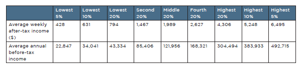
The highest 20% of households by income had twice the income of the middle 20% and five times that of the lowest 20%
Figure 1 and Table 1 divide the population into five equal-sized income groups according to the after-tax income of the households in which they live. It shows the average income for each group expressed in 2019 dollars per week after tax, and also as annual before-tax income in the table. The average incomes of the lowest and highest 5% and 10% are also shown for comparison:
- The highest 20% received $4,306 per week after tax ($305,000 per year before tax) twice the disposable income of the middle 20% ($1,989 per week or $122,000 per annum) and five times that of the lowest 20% ($794 per week or $43,000 per annum).
- The highest 5% (with $6,495 per week or $569,000 per annum) had three times the disposable income of the middle 20% and eight times that of the lowest 20%.
Figure 1: Average weekly after-tax income by household income group in 2019
Note: The population is divided into ‘income groups’ comprising individuals in households with different levels of after-tax income (after-tax income ‘equivalised’ or adjusted to take account of household size). Although incomes are equivalised to divide people into income groups, the average incomes for each group shown here are not equivalised.
Table 2: Average household incomes for different income groups (2019)
Note: These average household incomes are expressed in actual dollars not ‘equivalised dollars’. The top row shows weekly after-tax income and the second row shows annual gross (before tax) income
We are not all in the middle
Table 2 shows that a ‘middle income’ household (the middle 20%) has an average gross (before tax) annual income of $104,000 (rounded up to the nearest thousand). A typical household in this income group would comprise a couple with a full time wage and a part time wage.27Recent reports on inequality in Australia in our Poverty and Inequality Partnership series include: Davidson P (2022), A tale of two pandemics: COVID, inequality and poverty in 2020 and 2021. ACOSS/UNSW Sydney; and Davidson P & Bradbury B (2022), The wealth inequality pandemic: COVID and wealth inequality. ACOSS/UNSW Sydney.
People in the highest 20% group are more likely to receive two full time wages and substantial investment income (e.g. dividends from shares).
As shown later in this report, people in the lowest 20% are more likely than the other groups to rely on social security payments for a large part of their income – for example they are retired and receive the Age Pension.
The highest 20% had 41% of all household after-tax income, more than the lowest 60% combined.
Figure 2 shows how all household income was divided among five income groups of equal size.
- The highest 20% had 41% of all household after-tax income, compared with 17% for the middle 20%, 12% for the second-lowest income group and 6% for those in the lowest 20%.
Figure 2: Shares of national household income (% of total in 2019)
Note: Percentage of gross household unequivalised income received by each income group.
Wages and salaries were by far the largest income source, comprising 77% of all income
Figure 3 breaks down all household income (before tax) into its sources. It shows that wages and salaries were the largest income source (77% of all income), followed by investment and other income (10%), social security payments including Family Tax Benefits (8%) and own-business income (4%).
Figure 3: Composition of household income by source (% of all income in 2019)
Note: Income from each source as a percentage of all household income, before tax.
The lowest 20% relied on social security for half of their income whereas most of the income for higher-income groups came from wages
Figure 4 profiles the income sources of each income group.
- Wages and salaries contributed most of the before-tax income of all income groups except the lowest 20%.
- Social security payments comprised half the income (50%) of the lowest 20% but in our tightly ‘targeted’ system they contributed less than 10% of the incomes of the highest 60% of households.
- Investment income only contributed a sizeable share of the incomes of the highest income groups. For example, it contributed 23% of the income of the highest 5%.
Figure 4: Composition of income for each income group (% of total income in 2019)
Note: Percentage of total before-tax income from different sources, by income group.
The highest 20% received the lion’s share (59%) of investment income while the lowest 20% received over a third of all social security payments (37%)
Figure 5 shows that different income sources were distributed very unevenly among the income groups:
- The highest 20% received 59% of all investment income and a substantial share of own-business income and wages (47% and 43% respectively).
- At the other end of the scale, the lowest 20% received over a third of all social security income (37%) due to the highly targeted nature of our social security system.
Figure 5: Distribution of income by source across household income groups (2019)
Note: Percentage of each type of income (before tax) received by the income groups.
The overall level of income inequality in Australia is close to the average across wealthy nations
Figure 6 compares inequality in wealthy nations, using the Gini coefficient, a single measure of inequality where a value of zero means that all households have the same income while a value of one means that all income is received by a single household.
Measured in this way, income inequality in Australia is close to the average level for wealthy nations, based on data compiled by the OECD.
Figure 6: International comparison of income inequality (Gini coefficient) around 2021
In 2020, the COVID pandemic and the lockdowns introduced to slow its spread plunged the Australian economy into a recession, reducing private incomes (earnings and investment incomes) dramatically. Another wave of COVID infections and lockdowns followed in 2021. As discussed in a previous report in this series, household incomes were to a large extent shielded from these economic downturns by unprecedented income supports, especially the Coronavirus Supplement for people on income support and JobKeeper payment which subsidised the wages paid by employers impacted by lockdowns.28Davidson P (2022), A tale of two pandemics: COVID, inequality and poverty in 2020 and 2021. ACOSS/UNSW Sydney. In addition, many households were able to maintain consumption by withdrawing from their superannuation accounts – though these withdrawals are not counted in the income measures used here.
By the end of 2021, earnings and investment incomes had largely recovered and COVID income supports were withdrawn. In early 2022, the lingering impact of the economic stimulus imparted by the government, together with shortages of fuel and other products following the war in Ukraine, triggered a rise in consumer price inflation reducing the spending power of incomes. Subsequently, high inflation together with increases in interest rates to curb it depressed real (after-inflation) incomes.
This two-year rollercoaster ride for household incomes had major impacts on income inequality, with different forces working in opposite directions: for example, when the recession struck, higher unemployment increased inequality of private incomes while COVID income supports reduced it.
In this part of the report, we use more up-to-date data from a different source to the one used above to assess how household incomes fared, and what happened to income inequality, during the first two years of economic recovery from the COVID recession in 2020-21 and 2021-22. For convenience we refer to 2020-21 as ‘year one’ of the recovery 2021-22 as ‘year two’.29Our analysis charts the changes in average incomes from the COVID recession in 2019-20 to 2020-21 and 2021-22 respectively. Each of these financial years commences on 1 July and ends on 30 June of the following year. A more detailed breakdown of trends through each year is not available from the data source used. Major changes in economic conditions and policy responses do not correspond exactly with transitions from one financial year to the next. As detailed in the timeline below, the sudden rise in unemployment after the first COVID lockdowns occurred around April 2020 (in the final quarter of the 2019-20 financial year) and the employment recovery was already under way by July 2020 when ‘year one‘ of the recovery (2020-21) commenced. Further, the main COVID income supports commenced in April 2020 so they already had an impact on household incomes in the base year of our analysis (2019-20). In addition, the economic recovery was far from smooth: another round of lockdowns was imposed at the start of ‘year two’ of recovery (2021-22) and a new set of temporary income supports was introduced at that time. As discussed in ‘measuring inequality’ above, the data source used is the household distributional accounts published as part of the ABS Australian National Accounts series. As discussed previously, income is defined and measured differently in that series so these figures cannot be compared directly with those in earlier parts of this report, though the broad trends are similar. There are no distributional accounts data available for 2018-19 so this could not be used as a base year for our analysis. The data do not cover the more recent period of higher inflation and interest rate increases in 2022-23. The box at the end of this chapter of the report charts the timeline of key events and policy initiatives.
Average household incomes grew very strongly in year one of recovery (2020-21) then fell during year two (2021-22)
Figure 7 shows that during ‘year one’ of recovery (2020-21):
- Average household after-tax incomes grew by an extraordinary 3.1% after inflation, much faster than average income growth since the GFC (2007 to 2019) as discussed later.
- This occurred despite strict COVID lockdowns and the economic uncertainty surrounding the pandemic, which reduced average paid working hours per capita by 0.5% compared to hours worked in 2019-20.
During ‘year two’ (2021-22), these trends were reversed:
- Average household incomes declined by 0.7% after inflation despite the reduced severity of lockdowns and a solid 2.4% increase in overall paid working hours per capita.30The Treasury measure of ‘effective’ unemployment (which included people still employed but unable to return to work due to lockdowns or illness) rose from 5% to15% in the last quarter of 2019-20, then fell to 6% in the last quarter of 2020-21 and 4% in the last quarter of 2021-22 (Australian Institute for Health and Welfare 2021, Employment snapshot. Canberra; ABS Labour Force, Australia). Higher inflation contributed to the overall reduction in real incomes in ‘year two’, but the rise in inflation from 2% to 5% on an annualised basis took place at the end of that year so it is unlikely to be the main cause (ABS, Consumer Price Index).
Figure 7: Average changes in hours worked and household incomes from 2019-20 to 2021-22
Income inequality declined sharply in year one (2020-21) but was restored to its previous level in year two (2021-22)
Figure 8 shows that changes in income inequality during this two-year period were equally dramatic:
- In year one (2020-21), inequality declined. The average income of the lowest 20% grew by 5.2% after inflation, compared with 3% for the middle 20% and 2.4% for the highest 20%.
- In year two (2021-22) this pattern was reversed. The average income of the lowest 20% fell by 3.5%, compared with a fall of 0.5% for the middle 20% and a fall of 0.1% for the highest 20%.
- When we compare average growth in incomes for the two-year recovery period from 2019-20 to 2021-22, these effects largely cancel each other out leaving little change in income inequality overall. The income of the lowest 20% grew by an average of 0.8% per year, compared with 1.3% per year for the middle 20% and 1.1% per year for the highest 20%.
Figure 8: Average annual change in disposable income (after inflation) in lockdowns and recovery (%)
COVID income supports lifted incomes in year one (2020-21) and their removal, together with higher income tax payments, reduced them in year two (2021-22)
To help explain the trends outlined above, Figure 9 breaks household incomes down into their major components. It shows the average changes in the value of different components over this period.31These are average changes for all households, including those not receiving each form of income (e.g. social security payments).
In year one (2020-21):
- Average wages (including JobKeeper Payment) grew by $31 per week after inflation despite the reduction in overall paid working hours noted above;
- Average social security payments (including Coronavirus Supplement) rose by $23 per week, while average income tax payments declined slightly by $2 per week.
In year two (2021-22):
- Average wages barely grew (by just $6 per week after inflation) despite the strong recovery in paid working hours noted above;
- Average social security payments fell by $24 per week, while average income tax payments rose by $30 per week.
This helps explain the rise and fall of average household incomes discussed above:
- JobKeeper Payments of up to $750 per week buoyed up wages in year one (2020-21). Over that year they were widely distributed, averaging $106 per week per household including those that did not receive the payment.32In the data set we use here, the ABS includes JobKeeper Payments in wages but does not identify them separately. JobKeeper Payments commenced in April 2020 (at the end of 2019-20), grew rapidly through 2020 as employers took up this new wage subsidy and were subsequently reduced, then abolished in April 2021. Sources: Breunig R & Sainsbury T (2022), Too Much of a Good Thing? Australian Cash Transfer Replacement Rates During the Pandemic. Australian Economic Review, Vol 56, No 1, pp 70-90 and ABS (2022), Australian National Accounts, household distributional accounts. Towards the end of year one, they were reduced then abolished.
- Average social security payments rose substantially in year one (2020-21) due to the $275 per week Coronavirus Supplement (which doubled the lowest income support payments) and greater take-up of income support by people who lost paid working hours. The Coronavirus Supplement was substantially reduced, then abolished towards the end of year one.
- Average income tax payments barely increased in year one, due to low inflation (reducing ‘tax bracket creep’) and the Coalition government’s decision to bring forward ‘Stage Two’ of its income tax cuts worth an average of $13 per week per household (including those who did not pay income tax). In the absence of further tax cuts in year two, growth in taxable incomes and inflation lifted average income tax levels, reducing household disposable incomes.
Figure 9: Average annual changes in income components (after inflation) from 2019-20 to 2021-22 ($ per week)
The impact of government policy on income inequality over this two-year period was profound, with social security changes mainly impacting the lowest 40% and income tax changes the highest 40%
Figure 10 shows the changing impact of social security and income tax on average weekly disposable incomes over the two-year period for each household income group.
Changes in average social security incomes mainly impacted the lowest 40% of households, due to their targeting to people with low incomes:
- In year one (2020-21) when the Coronavirus Supplement was paid and more people were unemployed, average social security payments per household rose by $41 per week for the lowest 20% and by $40 per week for the second lowest 20%.
- In year two (2021-22) after the Coronavirus Supplement was abolished and unemployment declined, the previous increases in average social security payments were reversed. Average social security payments fell by $43 per week for the lowest 20% and by $42 per week for the second lowest 20%.33Due to data limitations (the Survey of Income and Housing is only conducted every two years) we use 2019-20 as the base year for this analysis but the Coronavirus Supplement was already paid during the last quarter of that year (from April to June 2020). If we were able to use the previous year (2018-19) as the base year, it is possible that average social security payments per household rose slightly over the following three years (2018-19 to 2021-22). Maximum rates for certain working-age payments (including JobSeeker Payment) were increased slightly after inflation (by $25 per week) when the Supplement was abolished in April 2022 (Davidson P 2021, op cit).
In contrast, changes in average income tax payments mainly impacted the highest 40%:
- In year one (2020-21) when Stage 2 tax cuts were brought forward, average tax payments rose by just $1 per week for the highest 20% and by $1 per week for the second highest 20%.
- However in year two (2021-22), average tax payments rose by $98 per week for the highest 20% and by $35 per week for the second highest 20%.34Note that the highest household income groups include many individuals with low taxable incomes, since there is typically more than one income-earner in each of these households.
Figure 10: Change in average social security and income tax payments by income group (after inflation), from 2019-20 to 2021-22 ($ per week)
 Source: ABS Australian National Accounts. Available: https://www.abs.gov.au/statistics/economy/national-accounts/australian-national-accounts-distribution-household-income-consumption-and-wealth/2021-22-financial-year
Note: Change in the average weekly value (after inflation) of social security payments received (including Family Tax Benefit) and income tax paid over each period shown.
Income definitions used here are different to those used in the ABS Survey of Income and Housing from which other data for this report are derived, so the composition of the (equivalised disposable) income groups is different (though the measures of average social security and income tax payments are similar in the two data series).
Table 3: COVID recession and recovery timeline
 Sources: Davidson, P (2022), A tale of two pandemics: COVID, inequality and poverty in 2020 and 2021. ACOSS/UNSW Sydney; Davidson P & Bradbury B (2022), The wealth inequality pandemic: COVID and wealth inequality. ACOSS/UNSW Sydney; Breunig R & Sainsbury T (2022), Too Much of a Good Thing? Australian Cash Transfer Replacement Rates During the Pandemic. Australian Economic Review, Vol 56, No 1, pp 70-90; Australian Institute for Health and Welfare (2021), Employment snapshot. Canberra.
1 Averaged across all households (including those not receiving the payment) and the whole year (including periods when it was not paid). Value of lump sum ‘early access’ superannuation payments averaged across the year for comparison (these are not included in the ABS household income statistics discussed above).
2. Effective unemployment is a measure used by the Treasury to assess the impact of COVID19 on the labour market. It included individuals who were temporarily ill or stood down due to lockdowns.
Figure 11 shows changes in the overall value of COVID income supports over the period under discussion
Figure 11: Value of major income supports during the pandemic ($ billions per month)
 Source: Frydenberg J (2022), Budget Paper No 1. Canberra.
Note: Average impacts on households (including those not directly affected) expressed as a percentage of average household after-tax incomes. CVS = Coronavirus Supplement. Superannuation lump sum payments are not included in household incomes as measured in the ABS ANA household distribution statistics used above.
Household after-tax incomes grew strongly up to the GFC in 2008, but have mostly stagnated since
Figure 12 shows that household incomes grew strongly in real terms (at an annual rate of 4.3% after taking account of inflation) during the boom period from 1999 to 2007. From the GFC in 2008 to the pandemic recession in 2019-20, overall household income growth was almost stagnant, at 0.6% per year after inflation.35If we break this down into two periods, household income growth was somewhat stronger from 2007 to 2013 (averaging 0.8% per year), a period in which a mineral export boom lifted Gross Domestic Product (though these were not boom years for household incomes), and weaker from 2013 to 2019 (0.3% per year) after the mining boom subsided. Economist Ross Garnaut referred the latter period as Australia’s ‘dog days’ (Garnaut R 2021, Reset, Restoring Australia after the Pandemic Recession. Black Inc Books. Melbourne).
Figure 12: Trends in real average household disposable income from 1999 to 2019 (in 2019 dollars)
Note: Average household after-tax income adjusted for inflation to 2019-20 values.
Income inequality increased in the decade of economic growth to 2008 and then plateaued.
Figure 13 shows that inequality of weekly household incomes as measured using the Gini coefficient increased from a value 0.305 in 1999 to 0.319 in 2007, before levelling off to 0.306 in 2017. Inequality of annual incomes increased more sharply from 0.306 in 1999 to 0.345 in 2007, falling back to 0.329 in 2014.36Unfortunately this was the last year for which annual income was measured by the ABS. These differences between trends in weekly and annual income inequality may be due to fluctuations in incomes across the year, or measurement issues such as whether respondents accurately recall their incomes.
This trend is consistent with estimates of the Gini coefficient or income inequality in Treasury’s wellbeing framework, except that Treasury’s estimates of inequality are consistently higher than ours, and – importantly – their analysis is confined to the period from 2007 to 2019.37The wellbeing framework finds that the Gini coefficient for income inequality declined from 0.34 to 0.32 over that period and concludes that income inequality ‘remained relatively steady since 2007–08’ (Treasury 2023, Wellbeing framework). This means that the wellbeing framework misses the sharp rise in income inequality from 2003 to 2007.
Figure 13: Overall trends in income inequality from 1999 to 2019 (Gini coefficients for weekly and annual income)
Note: The Gini coefficient is a measure of inequality whose value is zero if all incomes are equal and one if all income is received by a single household.
Changes in ABS survey methods (for both weekly and annual income) around 2007 mean that there is some uncertainty about changes in inequality at that time, but it is still possible to assess trends in inequality up until then (using the old measure) and afterwards (using the new measure).
In the boom years, income growth for the highest 20% surpassed that for middle- and low-income groups.
As figure 14 indicates, during the boom years up to 2007, growth in high incomes surpassed that of middle and lower-income households:
- The average after-tax incomes of the highest 20% rose by 40% from $2,658 per week in 1999 to $3,728 in 2007, compared with an increase of 32% from $1,348 to $1,784 for the middle 20% and an increase of 31% from $535 to $700 for the lowest 20%.
- The highest 5% of households saw their incomes grow even more strongly during the boom, from $3,620 a week to $5,773, a steep 59% increase.
A rising tide lifted all boats, but those at the top rose faster.
After the GFC in 2008, growth in household incomes flat-lined, along with income inequality
Figure 14 also indicates that income growth was sluggish and income inequality moderated slightly from 2007 to 2019:
- The average after-tax incomes of the highest 20% rose by 4% from $3,728 in 2007 to $3,895 in 2019-20, compared with an increase of 7% from $1,784 to $1,904 for the middle 20% and a rise of 12% from $700 to $783 for the lowest 20%.
- Average incomes for the highest 5% declined slightly over this period, by 0.4% from $5,773 to $5,749, though this was largely due to a decline in the final year (2019-20), when – unlike low and middle-income groups – they were not shielded from the impact of the COVID recession.38In 2017-18, the average income of the highest 5% was $6,412 per week, 11% above its 2007 level.
Figure 14: Trends in real average weekly after-tax income from 1999 to 2019 (in 2019 dollars)
Note: Average weekly household disposable incomes for different income groups, after taking inflation into account.
Figure 15 shows the average annual increase in incomes for each group, after inflation, up to and after the GFC.
Over the whole period from 1999 to 2019, average annual growth in household after-tax incomes for the highest 20% was 2.3% (after taking account of inflation), compared with 2.1% for the middle 20% and 2.3% for the lowest 20%.
This disguises major shifts in income growth and distribution before and after the GFC in 2008:
- Average incomes (after inflation) of the highest 20% rose by an average of 5% per year during the boom years (1999-2007) and 0.4% afterwards (2007-19). The incomes of the middle 20% rose more slowly in the boom years (by 4% per year) and by 0.6% afterwards. The incomes of the lowest 20% grew more slowly again in the boom (by 3.9% per year), then rose more quickly than the other groups (by 1% per year) after 2007.39One reason for the relatively strong growth in incomes for the lowest 20% was a substantial increase in pensions commencing in 2008 (Davidson P, Bradbury B; Wong M & Hill P (2020) Inequality in Australia, who is affected and why? ACOSS and UNSW Sydney.
Figure 15: Annual percentage increase in weekly income (after inflation) before and after the GFC in 2007-08
Note: Average annual increases in household disposable incomes for different income groups, after taking inflation into account. Increases throughout each period are simply divided by the number of years.
Over the whole period, the share of all household income accruing to the highest 20% rose by 0.4%, while that going to the middle and lowest 20% declined by 0.2% and 0.1% respectively
Figure 16 shows how the share of all household income received by different groups changed before and after the GFC.
In the boom years before the GFC, the share of the highest 20% rose by 1.6% while those of the middle and lowest 20% fell by 0.4% and 0.3% respectively.
After the GFC, there was a partial reversal in this trend towards greater inequality. The share of the highest 20% fell by 1.2%, while those of the middle and lowest 20% each rose by 0.2%.
Figure 16: Changes in income shares (% of all income) for different groups before and after the GFC in 2007-08
Note:
Note: Change in each income group’s share of overall income, in percentage points, compared with that at the start of each period.
The remainder of this Overview deals with the distribution of wealth among households, including owner-occupied housing, superannuation, financial investments, investment property and non-financial assets such as cars. We compare the wealth holdings of households ranked by both wealth and income, and trends in the level and distribution of wealth from 2003 to 2022. When calculating the value of wealth holdings, associated debt (for example home mortgages) is subtracted from the value of assets.
Wealth is much more concentrated at the top than incomes
Since wealth is largely income accumulated over time by people who can afford to save, it is much more unequally shared than income.
Figure 17 shows that in 2019 the average wealth of the highest 20% of wealth-holders was $3,240,000 – over five times that of the middle 20% who had a more modest $588,000; and 90 times the wealth of the lowest 20% (with just $36,000).40We provide estimates of the average level and distribution of wealth up to 2022 later in this report, derived from a different data source (see ‘measuring inequality’ above).
The average wealth of the highest 5% was $6,661,000.
Figure 17: Average household net wealth by wealth group ($000 in 2019-20)
The wealthiest 20% held almost two-thirds of all household wealth (64%), more than all other households combined
Figure 18 shows how wealth was divided up among households in 2019. The wealthiest 20% held 64% of all wealth, followed by 20% for the next-wealthiest 20%. The remaining 60% of households had just 17% of wealth between them.
Figure 18: Shares of all wealth held by wealth groups (% in 2019-20)
Half of household wealth is held in real estate (39% in the main home and 12% in investment property), compared with 41% in financial investments
Figure 19 shows that 38% of household wealth was held in owner-occupied housing, 12% in investment property, 22% in superannuation, another 20% in shares and other financial assets (such as bonds and bank accounts), and 9% in other non-financial assets such as cars.
Figure 19: Composition of household wealth (% of all wealth in 2019-20)
The wealthiest 20% held more of their wealth in shares, financial and property investments than other groups.
As we move up the wealth ladder, the pattern of wealth holdings changes (Figure 20).
At the bottom of the ladder, the most valuable assets of the lowest 20% were ‘other non-financial assets’ such as cars (45% of their wealth) and superannuation (42%). Since they were younger and had relatively low incomes, few owned their homes.
Moving up the ladder, the proportion of wealth held in owner-occupied housing rises (from 29% for the second-lowest 28% to 47% for the second-highest). The proportion held in superannuation declines from 33% to 22%.
At the top of the ladder, the wealthiest 20% held less of their wealth in the main home (33%) than those in the middle, and more of it in shares and other financial investments (24%) and investment property (16%).
Figure 20: Composition of wealth held by each wealth group (% of wealth holdings by type in 2019-20)
Ownership of financial assets such as shares and investment property is highly concentrated, with over 80% of each held by the highest 20%.
Figure 21 shows how different forms of wealth are distributed across wealth groups.
Contrary to the media image of the ‘mum and dad investor’ ownership of share and other financial investments and investment property was heavily concentrated in the hands of the wealthiest 20% (who held 78% and 82% of these forms of wealth respectively).
Superannuation was also very unequally shared, with 59% by value held by the highest 20% and 21% by the second-highest.
Owner-occupied housing was somewhat more equally distributed, with 55% by value held by the highest 20% and 26% by the second-highest.
Figure 21: Share of all wealth held by each wealth group, by asset type (per cent in 2019-20)
When wealth is compared across household income groups, it is somewhat more evenly distributed, due to high levels of outright home ownership among retirees with lower incomes.
When we compare average wealth among households ranked by income (as distinct from wealth), a somewhat different picture emerges (Figure 22).
The wealth of the highest 20% by income was valued at $2,047,000 – two-and-a-half times the middle 20% and three times the lowest 20%.
One reason that wealth inequality moderates when we measure it in this way is that the lowest 20% of households by income, many of whom are older people, had homes with an average value of $335,000 after mortgage debt is subtracted.41This average figure includes those low income-earners that do not own their homes. The average value of wealth in owner-occupied homes was fairly consistent across income groups, with four of the five groups holding no more than $400,000 in wealth in this form. The highest 20% had homes worth an average of $582,000 after mortgage debt is subtracted.
On the other hand, shares and other financial assets are once again heavily concentrated – in the hands of the highest 20% by income. Their average holdings were worth $563,000 – five times that of the middle 20% ($114,000) and six times that of the lowest 20% ($98,000).
Superannuation and investment property are less skewed towards the top, but still very unequally distributed. The average superannuation wealth of the highest 20% was $504,000 – two-and-a-half times that of the middle 20% ($205,000) and seven times that of the lowest 20% ($66,000). The average investment property
holdings of the highest 20% are worth $266,000 – three times that of the middle 20% ($90,000) and four times that of the lowest 20% ($75,000).
Figure 22: Average net wealth by asset type by income group ($000s in 2019-20)
In 2022 Australia had the fourth highest average wealth level per adult ($US497,000) in the world.
According to research published by UBS Bank, in 2022 Australia had the fourth highest average wealth per adult in the world, behind Switzerland, United States, and Hong Kong (Figure 23). One reason for Australia’s high ranking is that other wealthy countries have much more generous public pension systems. Future pension entitlements are not included in wealth, whereas private saving for retirement in Australia (e.g. via home ownership and superannuation) is included.
Figure 23: Average individual wealth across the world in 2022 (US dollars)
Source: UBS Bank (2023), Global wealth report. Geneva. Note that these figures refer to individual not household wealth and are expressed in US dollars (so changes in exchange rates impact the rankings).
Figure 24 compares wealth inequality in Australia and other wealthy nations in 2018. It indicates that wealth is distributed somewhat less unequally in Australia than the average OECD nation. Almost half of all wealth (49%) was held by the highest 10% of households in Australia compared with an OECD average of 52%, while the next 50% held 48% of wealth in Australia compared with 45% across the OECD.
Figure 24: Wealth inequality in wealthy nations (Shares of wealth held by different wealth groups in 2019)
As with income inequality, wealth inequality increased during booms and subsided during downturns. In overall terms, wealth inequality increased substantially from 2003 to 2022. In recent years, the pandemic recession reduced overall wealth and wealth inequality (especially via a fall in share values) then the economic recovery greatly increased the value of owner-occupied homes (reducing overall wealth inequality but leaving more people locked out of home ownership).42See our previous analysis of changes in wealth inequality from the start of the pandemic in 2019-20 through to December 2021 in Davidson P & Bradbury B (2022), The wealth inequality pandemic: COVID and wealth Inequality. ACOSS/UNSW Sydney and Daley J, Coates B, & Wiltshire T (2018), Housing affordability: re-imagining the Australian dream, Grattan Institute Report 2018-04, Melbourne.
This analysis of trends in wealth inequality relies on wealth data from ABS Survey of Income and Housing from 2003-04 to 2019-20, which we update to 2021-22 using data from the ABS Australian National Accounts Household income and wealth accounts data set.43As discussed in Measuring inequality above, we use ABS ANA data on overall changes in the value of major types of assets (such as owner-occupied housing) since 2019-20 to update the wealth distribution from that year to 2022-23. In this way we ensure that the data are reasonably comparable from 2003 to 2022, though recent changes in the distribution of wealth within each asset type are not taken into account.
From 2003 to 2022, the overall value of household wealth almost doubled (after inflation), led by strong growth in the value of superannuation, shares and other financial investments and investment property.
Over this period, average household wealth almost doubled from $676,000 to $1,177,000.
Breaking this down into the main components of wealth:
- The average value of household superannuation assets (including for those who do not have any) rose by 155% from $92,000 to $234,000.
- The average value of investment property rose by 99% from $74,000 to $147,000.
- The average value of shares and other financial assets rose by 76% from $125,000 to $220,000.
- For the largest asset – owner-occupied housing – there was a 58% increase from $302,000 to $479,000.
- For other non-financial assets, there was a 20% increase from $88,000 to $106,000 (Figure 25).44These figures are net of any associated debt.
Figure 25: Trends in average real household wealth by type from 2003-04 to 2022-23 (thousands of 2019 dollars)
Wealth inequality increased during the economic boom from 2003 to 2009 and moderated in downturns (after the GFC and COVID recession)
From 2003 to 2022, wealth inequality as measured using the Gini coefficient rose from 0.57 to 0.60, though growth in inequality was uneven through this period (figure 26). During the boom years from 2003 to 2009, the Gini coefficient rose from 0.57 to 0.60. After the GFC it fell back to 0.59, then resumed its rise to reach 0.62 in 2017. After the COVID recession it declined again to 0.60 in 2022.
The Treasury’s wellbeing framework only measures changes in wealth inequality from 2009 to 2019. It finds that the Gini coefficient increased from 0.6 in 2009 to 0.62 in 2019 before falling to 0.61 in 2019 and concludes that wealth inequality ‘remained steady’. However, this misses the sharp increase in the Gini coefficient from 2003 to 2009 noted above.45Treasury (2023), Wellbeing framework, income and wealth inequality.
Figure 26 breaks down these trends according to the contributions to overall inequality from different asset types:
- The increase in wealth inequality over the whole period was mainly generated by growth in the overall value of superannuation (whose contribution to the Gini rose from 0.8 to 0.11) and investment property (from 0.8 to 0.1), since the value of those assets grew fastest and they were distributed more unequally than owner-occupied housing and other non-financial assets.
Conversely, from 2003 to 2022, the proportion of wealth held in owner-occupied housing and other non-financial assets (both of which were relatively equally distributed) declined, so their overall contribution to growth in wealth inequality over this period was negative.46The contribution of each type of wealth to overall wealth inequality depends on its overall value and its concentration in the hands of wealthier households. Broadly speaking, changes in the contribution of different assets to wealth inequality were dominated by changes in their overall value, rather than changes in their concentration. These factors will be discussed in more depth in our next Inequality in Australia report.
Figure 26: Trends in wealth inequality (Gini coefficient) by asset type from 2003 to 2022
The Gini coefficient is a measure of inequality whose value is zero if all incomes are equal and one if all income is received by a single household.
Underlying values are updated from 2019-20 to 2022-23 using ABS Australian National Accounts data, assuming distribution of each asset type across households remains static. Wealth is adjusted for inflation and associated debt.
From 2003 to 2022, the highest 20% of households by wealth left the other 80% behind
Figure 27 shows that the average wealth of highest 20% rose sharply after inflation from $1,996,000 in 2003 to $3,632,000 in 2022 while growth in wealth for the rest of the population was more modest. The average wealth of the middle 20% rose from $428,000 to $689,000, while that of the lowest 20% rose from $35,000 to $42,000.
Figure 27: Trends in average real wealth by wealth group from 2003-04 to 2021-22 (in thousands of 2019 dollars)
Figure 28 shows the divergence in fortunes between high-wealth households and the rest in starker terms. From 2003 to 2022, the average wealth of the highest 20% grew by 82% after inflation, easily surpassing the 61% increase for the middle 20% and 20% for the lowest 20%.
Figure 28: Increase in average real wealth by wealth group, from 2003-04 to 2022-23 (%)
Note: Overall percentage change in average household wealth by wealth group
Updated from 2019-20 to 2022-23 using ABS Australian National Accounts data, assuming distribution of values of each asset type across households remains static. Values adjusted for inflation using the CPI. Average household wealth minus debt.
From 2003 to 2022, the share of wealth held by the wealthiest 20% rose by 2.7% while that of the rest of the population declined.
Figure 29 shows how the share of all wealth held by different groups changed from 2003 to 2022. The share of the wealthiest 20% grew by 2.7 percentage points, while that of the middle 20% declined by 1 percentage point and that of the lowest 20% fell by 0.3 of a percentage point.
Figure 29: Change in share of overall wealth by wealth group, from 2003-04 to 2022-23 (%)
ISSN: 1326 7124
ISBN :978 0 85871 103 7
Inequality in Australia 2023: Overview is published by the Australian Council of Social Service, in partnership with the University of New South Wales
Locked Bag 4777
Strawberry Hills, NSW 2012
Australia
Email: [email protected]
Website: www.acoss.org.au
© Australian Council of Social Service and UNSW Sydney, 2023
This publication is copyright. Apart from fair dealing for the purpose of private study, research, criticism or review, as permitted under the Copyright Act, no part may be reproduced by any process without written permission. Enquiries should be directed to the Publications Officer, Australian Council of Social Service. Copies are available from the address above.
About this report: This report is the latest in the Poverty in Australia series, part of the Poverty and Inequality Partnership between ACOSS and UNSW Sydney. Find out more at
http://povertyandinequality.acoss.org.au
This report should be referenced (or cited) as follows: Davidson P, Bradbury B, Wong M & Hill T (2023), Inequality in Australia 2023: Overview. Australian Council of Social Service and UNSW Sydney
Photos by Austockphoto.com.au All images are representative only.
With thanks to our partners: