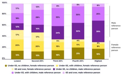
This graph shows the structure of social security payments in 2017-18, the year of the income survey on which the data in this website is based. These are not current payment rates.
[infogram id=”_/VA3mJ1gLA6e2gv0KkMNE” prefix=”4Ah” format=”interactive” title=”Social security rate structure, maximum rates of payment for different family types with no private income ($ per week)”]