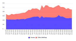
New private dwelling completions, seasonally adjusted, September 2011 to June 2020
This graph reflects a boom in private dwelling construction, corresponding to waves of investor finance over the period. Since 2018, the pipeline of new dwellings has contracted, and particularly since March 2020. There appears to be a reorientation towards detached homes, but given the natural month-to-month fluctuation in apartment and unit approvals, and notwithstanding the months immediately following the implementation of COVID-19 restrictions, it is too soon, given the data within this graph, to determine whether this is a lasting trend.
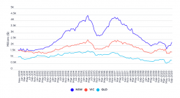
Value of new home loan commitments for investor purchase, seasonally adjusted, November 2010 to September 2020
This graph shows two waves of investor finance for NSW, QLD and Victoria, before and after 2015-16, corresponding with substantial growth in the supply of privately rented dwellings. From the beginning of 2010-11 to the end of 2013-14, approximately 262,000 additional households, and in 2017-18, another 245,000 households, entered the private rental sector, according to the Australian Bureau of Statistics (Housing Occupancy and Costs)
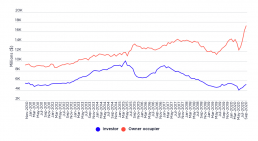
Value of new home loan commitments in Australia, seasonally adjusted, November 2010 to September 2020
This graph shows that the trend before 2017-18 was one in which investor purchasers were receiving a growing share of new home loan commitments (besides a contraction during 2015-16). However, in COVID times, owner-occupier finance has rebounded more sharply than investor finance, which only recovered to pre-pandemic levels as of September 2020.
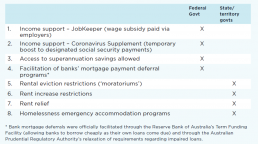
Key pandemic policy innovations relevant to minimising housing market disruption and homelessness in Australia
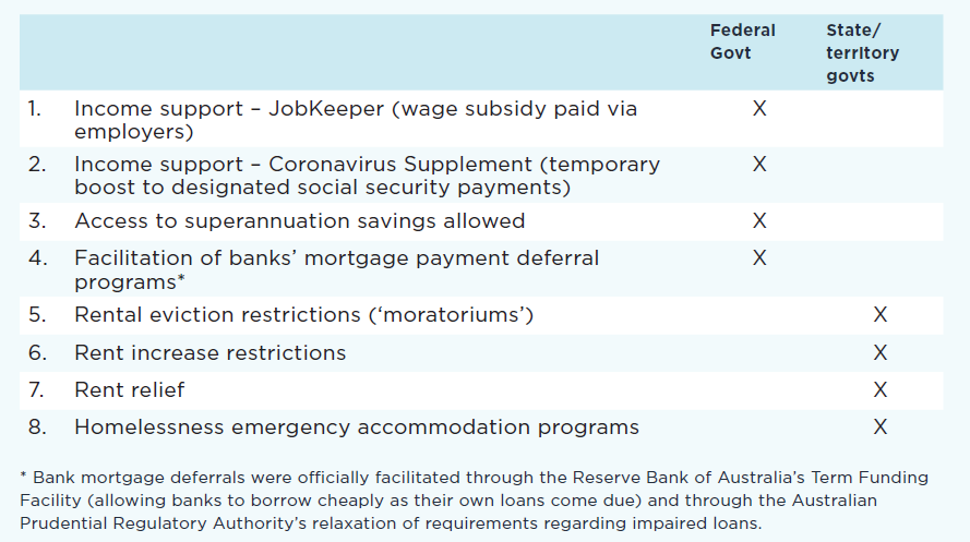 This table shows the key policy innovations that were introduced in Australia at the start of the COVID-19 pandemic in order to minimise the impact on housing and homelessness. Items 5-8 are the focus of the Poverty and Inequality Partnership report Covid-19: Rental housing and homelessness impacts - an initial analysis

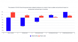
Changes in employment, hours and wages by percentage from March to June 2020
The spread of COVID-19 and the government-ordered lockdowns to contain it had a sudden and profound impact on employment and earnings in Australia. This graph shows that, in just the three months from March to May 2020, paid hours worked declined by 10% and employment fell by 6%, whilst wages paid were reduced by 8.3%. In June, there was a modest recovery in paid working hours and wages as lockdowns easied, but unemployment and underemployment continued to rise. The unemployment rate stood at 7.4% in June 2020.
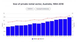
Size of private rental sector, Australia, 1994-2018
This graph shows that, in 2009-10, households renting from a private landlord made up around 23.7% of all households. In 2017-18, they constituted 27.1%.

Trends in wealth inequality (Gini coefficient) by asset type
This graph shows how wealth inequaltiy increased from 2003 to 2009, declined slightly after the Global Financial Crisis (GFC), and resumed its growth afterwards. During the boom years from 2003 to 2009, the Gini coefficient for wealth inequality increased from 0.57 to 0.62. After the GFC it fell back to 0.59, then continued to rise to reach 0.62 in 2017. This increase in wealth inequality was mainly generated by growth in the overall value of superannuation, shares and other financial investments, and investment property - all of which were relatively concentrated in the hands of high-wealth households from the outset (though they became less concentrated over time). Conversely, the proportion of wealth held in owner-occupied housing and other non-financial assets (which were more evenly distributed in 2003) declined, so their overall contribution to growth in wealth inequality was negative. If we break down the overall increase in the Gini coefficient of 0.05 (0.62 minus 0.57) to…
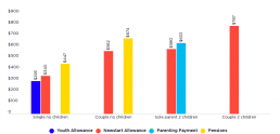
Social security rate structure
This graph shows the structure of social security payments in 2017-18, the year of the income survey on which the data in this website is based. These are not current payment rates.
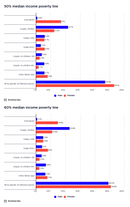
Profile of poverty by gender of household reference person
This graph shows the household types of people in poverty by gender of household reference person. It shows that shows that among people in poverty in older single-person households (65 years and over), women greatly outnumber men (comprising 6% of all people in poverty when the 50% of median income poverty line is used, and 8% using the 60% median income poverty line; compared with 3% who are older single men - 4% using the 60% median income poverty line). However, among people in poverty in older couple households, more are found in households with a male main earner (comprising 6% of all people in poverty according to the 50% median income poverty line and 7% according to the 60% median income poverty line, compared with 2% in older couple households with a female main earner according to both poverty lines), reflecting the predominance of couples with a male main earner in that age group.