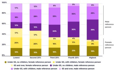
This graph shows the profile of households in poverty by their main income source in 2017-18 and 2016-17. It shows that the largest group of households in poverty is that relying on social security.
2017-18
[infogram id=”_/9Hz2sXb7F8L6HnZsL5e4″ prefix=”sHG” format=”interactive” title=”2017-18_ Profile of poverty by main income source (% of households in poverty)”] Households relying on social security represent 51% of households in poverty when the 50% and 60% median income poverty lines are used. The share of households living in poverty who are reliant on mainly on wages is significant, reflecting the higher share of wage-earning households overall. This group represents 38% of households in poverty using the 50% median income poverty line and 40% using the 60% of median income poverty line.
2015-16
[infogram id=”_/fjbtAsdFO5dXwmxOXIg8″ prefix=”pta” format=”interactive” title=”Fig.14_ Profile of poverty by main income source (% of households in poverty)”]Households relying on social security represent 53% of households in poverty when the 50% median income poverty line is used and 55% when the 60% of median income poverty line. The share of households living in poverty who are reliant on mainly on wages is significant, reflecting the higher share of wage-earning households overall (38% of all households in 2015). This group represents 38% of households in poverty using the 50% median income poverty line and 49% using the 60% of median income poverty line.