[infogram id=”_/oPpZqcAZ5xL6HtnhQS4R” prefix=”HCT” format=”interactive” title=”Fig.33_Trends in social security payments compared with wages”]
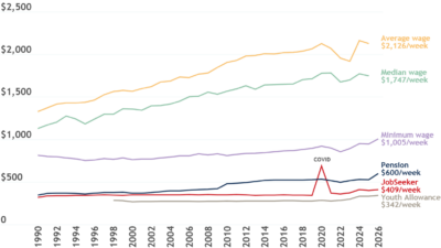
This graph compares the single maximum rate of Newstart Allowance and pension payments with wages, represented by the minimum wage, average weekly full-time earnings and the median full-time wage, in 2018 dollars. It shows that the gap between the Newstart Allowance and single pension rates, as well as average and median wages, has grown over time.