
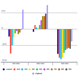
Impact of past recessions on household after-tax incomes
[infogram id="_/WP65tikBeaoXuw5ASAS9" prefix="QJJ" format="interactive" title="Figure 3_Impact of past recessions no household after-tax incomes (% change over each period)"] This figure shows changes in household after-tax incomes brought about by the recessions of the early 1980s and 1990s (left and right-hand clusters).
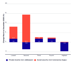
Changes in average before-tax income of households ranked by private income March-December 2020
[infogram id="_/qxrvFdhIeW4cATxHFZv7" prefix="HvQ" format="interactive" title="Figure 2_Change in average before tax income of households"] This graph shows that, from March 2020 to December 2020: * The average incomes of the lowest 20% income group (who mainly relied on pensions) rose by 8% ($56pw); * Those of the next 20% (mainly low-paid workers and families on income support) rose by 11% ($144pw); * The average incomes of the middle 20% rose by 3% ($53pw) and those of the next 20% rose by 2% ($67pw); * In contrast, the average incomes of the highest 20% fell by 4% ($230pw).
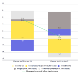
Change in household income (as a % of after-tax income in June 2019)
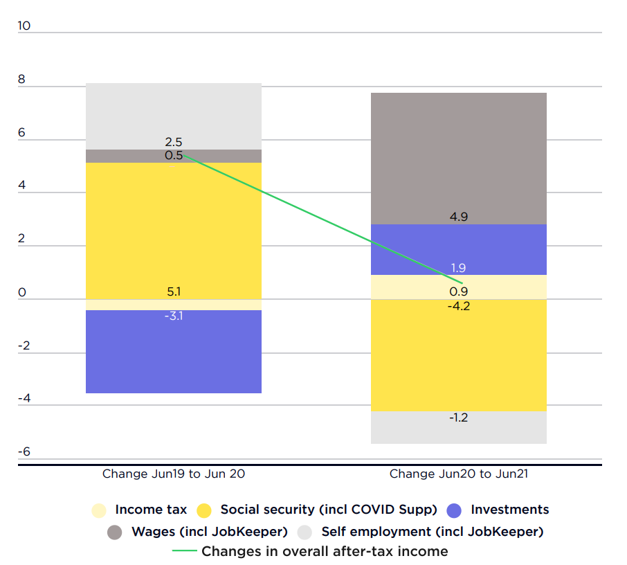 Source: Australian Bureau of Statistics, Australian National Accounts.
Note: Shows growth in different components of household income from June 2019 (before COVID) to June 2020 (recession), and from June 2020 to June 2021 (recovery), as a percentage of average after-tax household income in June 2019. Income tax is expressed in negative values (so a positive value means a reduction in tax). Note that the value of some components fell. Yellow = an increase would be expected to reduce inequality (more so if darker); Blue = an increase would be expected to increase inequality (more so if darker). Grey = an increase has an indeterminant impact on inequality.
This graph compares changes in the main components of household incomes in the…
Source: Australian Bureau of Statistics, Australian National Accounts.
Note: Shows growth in different components of household income from June 2019 (before COVID) to June 2020 (recession), and from June 2020 to June 2021 (recovery), as a percentage of average after-tax household income in June 2019. Income tax is expressed in negative values (so a positive value means a reduction in tax). Note that the value of some components fell. Yellow = an increase would be expected to reduce inequality (more so if darker); Blue = an increase would be expected to increase inequality (more so if darker). Grey = an increase has an indeterminant impact on inequality.
This graph compares changes in the main components of household incomes in the…
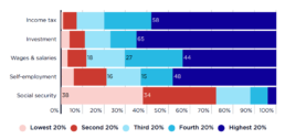
Distribution of income by source (percentage of all income)
This chart shows how the distribution of income by source is distributed unevenly across the household income groups. [infogram id="_/CUd6TdpsI9SKISE7jjjj" prefix="tCS" format="interactive" title="2023 Income distribution of people in households by main income source"] 2019-20: The highest 20% received 59% of all investment income and a substantial share of own-business income and wages (47% and 43% respectively).. At the other end of the scale, the lowest 20% received over a third of all social security income (37%). 2017-18: The highest 20% received two-thirds of all investment income and a large share of own-business income and wages (48% and 44% respectively). At the other end of the scale, the lowest 20% receives over a third of all social security income (38%).
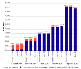
Average before-tax household income ($pw)
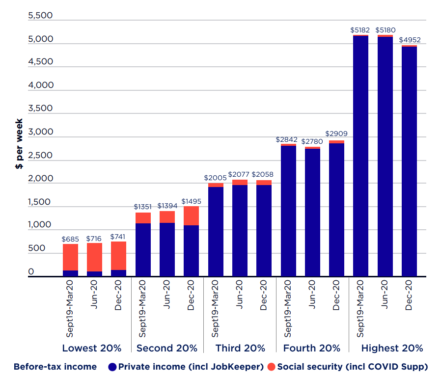 This chart shows trends in before-tax incomes for households ranked by private income from March 2020 (just prior to the COVID recession) to June 2020 (when Australia was locked down, and effective unemployment reached 17%) and December 2020 (when most lockdowns had eased and effective unemployment had declined to 7%).
It shows that, from March to December 2020, average before tax incomes:
* Rose from $685pw to $741pw for the lowest 20% of households ranked by income;
* Rose from $2,005pw to $2,058pw for the middle 20%;
* Fell from $5,182 pw to $4,952pw for the highest 20%.
These figures indicate that income inequality declined despite the recession, an extraordinary result given past experience
This chart shows trends in before-tax incomes for households ranked by private income from March 2020 (just prior to the COVID recession) to June 2020 (when Australia was locked down, and effective unemployment reached 17%) and December 2020 (when most lockdowns had eased and effective unemployment had declined to 7%).
It shows that, from March to December 2020, average before tax incomes:
* Rose from $685pw to $741pw for the lowest 20% of households ranked by income;
* Rose from $2,005pw to $2,058pw for the middle 20%;
* Fell from $5,182 pw to $4,952pw for the highest 20%.
These figures indicate that income inequality declined despite the recession, an extraordinary result given past experience
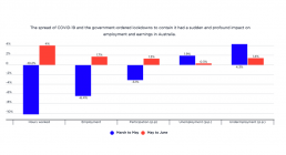
Changes in employment, hours and wages by percentage from March to June 2020
The spread of COVID-19 and the government-ordered lockdowns to contain it had a sudden and profound impact on employment and earnings in Australia. [infogram id="_/5dtCRjqv5B8tiEAPsvD0" prefix="bc4" format="interactive" title="2017-18: Fig.1_covid impact on employment"] This graph shows that, in just the three months from March to May 2020, paid hours worked declined by 10% and employment fell by 6%, whilst wages paid were reduced by 8.3%. In June, there was a modest recovery in paid working hours and wages as lockdowns easied, but unemployment and underemployment continued to rise. The unemployment rate stood at 7.4% in June 2020.
Inequality in Australia 2020, Part 2: Who is affected and why
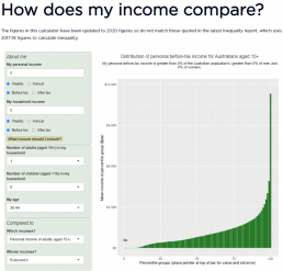
Read the report: Inequality in Australia 2020, Part 2: Who is affected and why Where do you stand in Australia's income distribution? Find out now with our income calculator!