
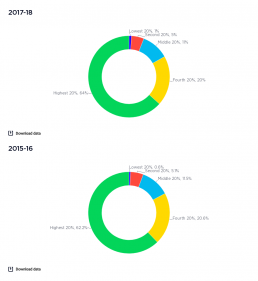
Shares of national wealth by wealth group
This graph shows how wealth is divided up among households. This probably underestimates of the true extent of wealth inequality. The wealthiest 1%, who own a disproportionate share of all wealth, are a small number of people and so are underrepresented in household surveys. It is also likely that many under-report their wealth. See the pie chart showing shares of income by income group. [infogram id="_/65ST6ouC4exyuNl9aBxk" prefix="q0E" format="interactive" title="2017-18: Fig.13_Shares of national wealth by wealth group"] 2017-18: The wealthiest 20% holds 64% of all wealth, followed by 20% for the next wealthiest group. The remaining 60% of households have just 17% of wealth between them. 2015-16: The highest 20% of household wealth groups holds 62% of all wealth. The middle 20% wealth group holds 12%, and the lowest 20% wealth group holds less than 1%. Wealth is highly concentrated at the very top. The highest 10% wealth group owns 45% of all wealth while the highest 5% owns 32%…
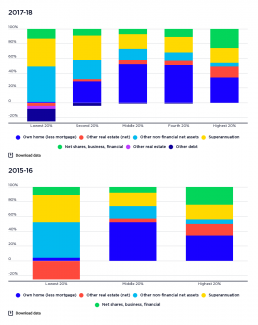
Profile of wealth holdings of wealth groups
This graph shows the components of wealth for each wealth group. The profile of assets held changes as we move up the household wealth scale. [infogram id="_/lMimxBnW8njODTC0wPqg" prefix="Wnw" format="interactive" title="2017-18: Fig.15_Profile of wealth holdings of wealth groups (% of wealth of each group in 2017-18))"] 2017-18: The holdings of the lowest 20% wealth group are mainly in 'other non-financial assets' such as cars (48% of heir wealth holdings) and superannuation (38%). Few own their homes. Moving up, the proportion of wealth held in owner-occupied housing rises (from 29% for the second-lowest wealth group to 51% for the second-highest). The proportion held in superannuation declines from 33% to 21%. In the highest wealth group, relatively less of the wealth is in the main home (34%) than those in the middle, and more of it in shares and other financial investment (26%) and investment property (15%). 2015-16: Most of the wealth of the lowest 20% wealth group is in…
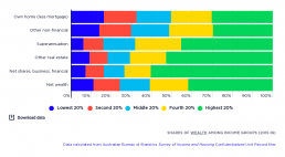
Wealth distribution among income groups
[infogram id="_/4N7S8BZx3Jz1J48mkD22" prefix="R0G" format="interactive" title="Fig.5_Shares of wealth across income groups by asset type (2016)"] Wealth is more evenly distributed across income groups than across wealth groups. The highest 20% of households by income hold 42% of household wealth, compared with 15% for the middle 20% and 11% for the lowest 20%. The main reason for the more even distribution of wealth among household income groups is the high home ownership rate among older people, who tend to have lower incomes. This is likely that this will change in future as a declining share of older people own their main home The highest 20% income group holds 30% of all wealth in main residences, compared with 17% for the middle 20% income group; and 16% for the lowest 20% income group. Other forms of wealth are much less evenly distributed across household income groups. The highest 20% income group owns 60% of all shares and other financial assets, 53% of investment real…
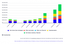
Value and profile of household wealth for each income group
This graph shows the distribution of wealth across income groups. It is more evenly distributed than across wealth groups, due largely to high levels of home ownership among retirees. 2017-18 [infogram id="_/5aKtLnSzqu369HNIYRC2" prefix="vAl" format="interactive" title="2017-18: Fig.17_Shares of wealth across income groups by asset type (2016)"] The wealth of the highest 20% by income is valued at $2,148,000, almost three times as much as the middle 20% and four times as much as the lowest 20%. The average value of wealth in owner-occupied homes is fairly consistent across income groups, with four of the five groups holding no more than $400,000 in wealh in this form. The highest 20% have homes worth an average of $496,000 after mortgage debt is subtracted. Shares and other financial assets are heavily concentrated in the hands of the highest 20% by income. Their average holdings are worht $622,,00 - five times that of the middle 20% ($124,000) and nine times that of the lowest 20%…
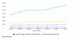
Trends in average wealth by wealth group
This chart shows the real value (after inflation is taken into account) of average wealth holdings of each wealth group, compared over time. [infogram id="_/51MQ2FcUK1NbokAkbwvC" prefix="zTW" format="interactive" title="2017-18: Fig.21_Trends in average wealth by wealth group from 2002-03 to 2015-16 (000s of 2016 dollars)"] As with income inequality, changes in wealth inequality were driven mainly by the highest 20% wealth group, although this growth was more volatile than for middle and low wealth groups. This was due in part to the greater share of the wealth of the highest 20% held in financial assets such as shares. The average household wealth of the highest 20% rose from $1.9 million in 2003-04 to $2.6 million in 2009-10, declined to $2.4 million in 2011-12 and rose again to $3.255 million in 2017-18.

Increase in average wealth by wealth group
[infogram id="_/DXwhDVpKjLxkxdF1UQWL" prefix="ZgV" format="interactive" title="2023_increase in average wealth by wealth group v2"] This graph compares the increase in real value (after inflation is taken into account) of average wealth holdings of each wealth group. Between 2003-04 and 2022-23: The average wealth of the highest 20% wealth group rose by 82%. The average wealth of the middle 20% wealth group rose by 61% The average wealth of the lowest 20% wealth group rose by 20%.
Change in share of overall wealth by wealth group
[infogram id="_/TfznlPfDwnU5SScrrJtO" prefix="jYL" format="interactive" title="2023_change in share of overall wealth by wealth group V2"] This charts hows how the share of all wealth held by different groups changed from 2003 to 2022. The share of the wealthiest 20% grew by 2.7 percentage points, while that of the middle 20% declined by 1 percentage point and that of the lowest 20% fell by 0.3 of a percentage point.

Change in shares of overall wealth by wealth group
This shows changes in the shares of overall household wealth held by each wealth group. [infogram id="_/JNFGRm7KnztFQIFqH9Rm" prefix="7hv" format="interactive" title="2017-18: Fig.23_Change in shares of overall wealth by wealth group, from 2003-04 to 2017-18 (%)"] Between 2003-04 and 2017-18, the highest 20% wealth group increased its share of overall wealth by 4.5%, while the share of all other groups declined. This represents an unambiguous increase in wealth inequality over the period.
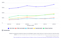
Trends in average household wealth in different assets
[infogram id="_/L9IpRLkDlq24qh6kR1eF" prefix="Acv" format="interactive" title="Fig.6_Trends in average household wealth in different assets, from 2003-04 to 2015-16 (000s of 2016 dollars)"] This shows compares the real value (after inflation is taken into account) of average wealth holdings in different assets. The average value of owner-occupied housing (the largest component of household wealth) rose strongly before the Global Financial Crisis, declined between 2009-10 and 2011-12, and then resumed its strong growth. Overall, the average value of owner-occupied housing rose by 28% (after inflation) during this period. The value of other real estate (investment property) followed a similar pattern. But grew much more strongly overall, by 61%. The average value of superannuation holdings grew very strongly and consistently across the period (by 119% overall), so that its share of wealth holdings increased. From 2003-04 to 2015-16, the share of owner-occupied housing in all household…
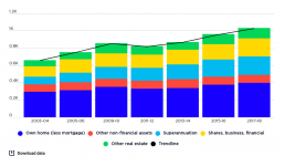
Trends in the concentration of wealth in different assets, from 2003-04 to 2017-18
[infogram id="_/oBP5G0M6HRz3FuVsE88V" prefix="chr" format="interactive" title="2017-18: Fig.19_Trends in wealth inequality (gini coefficient) by asset type from 2003-04 to 2017-18"] From 2003-04 to 2017-18, the overall value of household wealth rose by 56% after inflation, led by strong growth in the value of superannuation, shares and other financial investments, and investment property. In that time, the average value of superannuation held by households (including those who do not have it) rose by 141% from $89,000 to $214,000, shares and other financial assets rose by 74% from $121,000 to $210,000 and investment property rose by 66% from $71,000 to $119,000. The average value of the largest asset - owner-occupied housing - grew at a more modest 35% from $294,000 in 2003 to $398,000 in 2017, along with 8% growth in the value of other non-financial assets from $86,000 to $92,000.