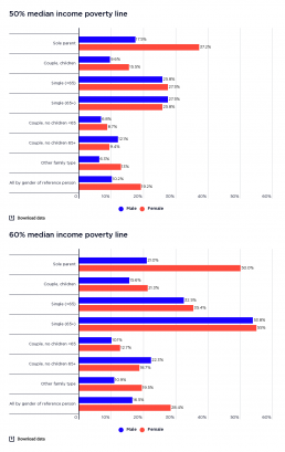
Rate of poverty by gender of household reference person (% of all people)
This graph shows the rate of poverty according to the gender of the household reference person by household type. It shows that the rate of poverty in sole parent families where the main earner is female is 37% using the 50% median income poverty line, and 50% using the 60% median income poverty line. This is over twice that of sole parent families where the main earner is male (at 18% using the 50% median income poverty line and 21% using the 60% median income poverty line). It also shows that couple-with-children households where the main earner is female have a rate of poverty far higher than those in which the main earner is male (16% female and 10% male according to the 50% median income poverty line; and 21% female and 16% male according to the 60% median income poverty line). The graph shows that the differences in poverty rates among households with male and female main earners are not as stark for households without children as for those with children.
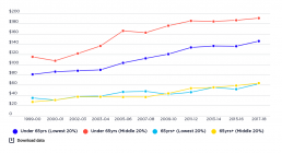
Housing costs of lowest 20% compared with middle 20%, among people aged <65 and 65+ (in $2017-18 per week)
This graph shows trends in average weekly housing costs for people of different ages in the lowest and middle 20% of households by income (adjusted for family size). Note that these amounts are adjusted downwards for household size, so they are much lower than average housing costs – for example – for a family of four people. It shows that housing costs grew strongly from 2005-06 to 2017-18, especially among the lowest 20% of working-age households by income. From 2005-06 to 2017-18, average housing costs for the lowest 20% of working-age households (under 65 years) grew more than twice as fast as those of the middle 20% (by 42% compared 15%). Among the lowest 20% of working age households, average housing costs rose from $103pw to $146pw. Average housing costs for the middle 20% rose from $166pw to $191pw. Possible contributing factors for this disparity include higher rent increases for low-income households of working age and rapid growth in the share of renters among that group.…
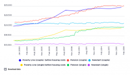
Comparison of poverty lines with pension and Newstart (now JobSeeker) payments for singles and couples without children (in $2017-18 per annum)
Social security policies clearly have an impact on poverty, for better or for worse. Because most major income support payments are below the poverty line, in order to escape poverty people need to supplement or replace them with private income from other sources. This graph compares trends in maximum pension and Newstart Allowance rates and poverty lines from 1999-00 to 2017-2018. It shows that while Newstart Allowance for singles was consistently well below the poverty line, it was above the line for couples up until 2004. This reflects an historical legacy: unlike payments for singles, unemployment payments for couples were tied to the pension rate until 1998. In contrast, pension rates for both singles and couples have closely tracked poverty lines. One reason for this is that pensions are indexed in line with both movements in prices and wages (whichever is larger). The impact of the $32pw increase in the single pension rate in 2009 is clearly visible, lifting that payment close…
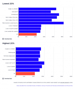
Share of people with different characteristics in the lowest and highest 20% income groups
The first half of this graph shows the share of each group of people with a particular characteristic who are in the lowest 20% income group of households. Older people, single people and sole parents, and those who rely mainly on government income support payments are more likely to be in the lowest 20% income group. The most important influence on incomes is labour force status. People living in households where the household reference person is not in the labour force or is unemployed are much more likely to be in the lowest 20% income group. People living in Tasmania and South Australia are also more likely to be in lowest 20%, along with people living outside capital cities. The second half of this graph shows that those more likely to be in the highest 20% income group are of working-age and in couple households without children (noting that income is adjusted to take account of the costs of children). People employed fulltime are more likely to be in the highest 20%, along…
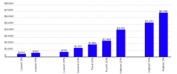
Average household incomes for different income groups
This table shows the average income of households in Australia, split by groups of 20% by income; as well as the highest and lowest 10% and 5% income groups. 2017-18: Somebody in the highest 20% group lives in a household with over twice the average weekly disposable income of the middle 20% ($4,166 per week compared with $1,884), and five times as much disposable income of a household in the lowest 20% ($753 per week). The average income of the middle 20% ($1,884a week) is two and half times that of the lowest 20% ($753). Income is heavily concentrated at the top: average income in the highest 5% (at $5,796) is more than one-and-a-half times the average of the highest 20%. 2015-16: This shows that somebody in the highest 20% group lived in a household with over twice the average weekly disposable income of the middle 20% ($3,978 per week compared with $1,779), and five times as much disposable income of a household in the lowest 20% ($735 per week). The average income of the middle…
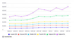
Trends in real average household disposable income
This graph shows the average annual growth in household after-tax incomes for each quintile from 1999-00 to 2017-18. During this period, average annual growth for the highest 20% (after taking account of inflation), compared with 2.2% for the middle 20% and 2% for the lowest 20%. While this is the case, there were major shifts in income growth and distribution before and after the Global Financial Crisis (GFC) in 2008. During the boom years growth in high incomes suprassed that of middle and lower income households. The average after-tax incomes of the highest 20% rose from $2,581 per week in 1999-00 to $3,619 in 2087-08 (5%0 per year). This compares with an increase from $1,308 to $1,733 for the middle 20% (4.1% a year) and an increase from $519 - $680 for the lowest 20% (3.9% a year). The income of the highest 5% rose during the boom from $3,514 a week to $5,611 (7.5% a year). After the GFC, growth in household income generally flat-lined, along with the trend in income…
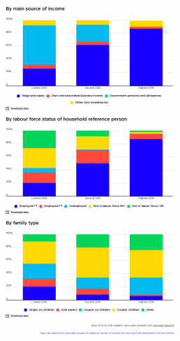
Who sits in the lowest 40% and top 20%?
This shows what kinds of households sit in the highest, middle and lowest 20% household income groups, by main income source and the employment status of the household reference person (usually the household member with the highest income). It shows that most people in the lowest 20% are in households that rely mainly on government pensions and allowances (60%) for their income. Unsurprisingly, most (58%) of people in the lowest 20% belong to households in which the reference person is not in the labour force (for example, retired, has a disability, or caring for a family member)Another 7% are in households whose reference person is unemployed. More surprisingly, 20% of the lowest income group are in households whose reference person is employed full time. These are mainly families with children, since we have adjusted their household incomes downwards to reflect their higher costs. For this reason, almost half (46%) of the lowest 20% are in families with children, including a…
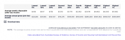
Average weekly disposable income
This content is password protected. To view it please enter your password below: Password:
Average weekly disposable income
These charts show average weekly household incomes (including social security payments and after tax has been deducted), by household income group in 2015-16 and 2017-18. For this purpose, individuals have been divided into five equal groups ranked by household income. At the highest and lowest ends of the income scale, extra columns have been added to show the average household incomes of the highest and lowest 10% and 5%. 2019-20: The highest 20% income group received $4,306 per week after tax ($305,000 per year before tax) twice the disposable income of the middle 20% ($1,989 per week or $122,000 per annum) and five times that of the lowest 20% ($794 per week or $43,000 per annum). The highest 5% (with $6,495 per week or $569,000 per annum) had three times the disposable income of the middle 20% and eight times that of the lowest 20%. 2017-18: A person in the highest 20% of households has $4,166 per week, more than twice the income of the middle 20% ($1,884 per week) and nearly 6…
Shares of national household disposable income
This shows how all household income in Australia is shared among five groups ranked by income, each comprising 20% of the population. 2019-20: In 2019-20, the 20% of people in the highest income group received 41% of all household income in Australia. This was more than that received by the middle 20%, which received 17% of all household income. Those in the lowest 20% received only 6% of all household income, while those in the second lowest income group received 12% of all household income. 2017-18: In 2017-18, the 20% of people in the highest income group received 42% of all household income in Australia. This was more than that received by the lowest 3 income groups, who received 35% of all household income. Those in the lowest 20% received only 6% of all household income, while those in the second lowest income group received 12% of all household income. 2015-16: The graph shows that, in 2015-16, the 20% of people in households with the highest income group received 40% of all…