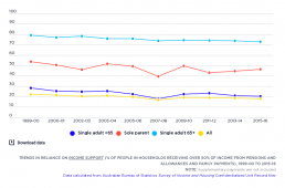
Trends in reliance on social security
The percentage of people in households relying mainly on social security for their income declined overall between 1999-00 and 2015-16, although the share of people of working age relying on these payments rose in 2007-08 due to the Global Financial Crisis. This long-term decline in social security reliance was due mainly to lower unemployment (before 2008), the closure of ‘pension’ payments for people between 50 and 64 years in the mid-1990s, ‘welfare to work’ policies that also restricted access to pension payments for people of working age (in 2007 and 2012), and growth in the private incomes of retirees (from superannuation, employment and other investments). You can find out more about changes in Australia’s income support system on our Causes and Solutions page.
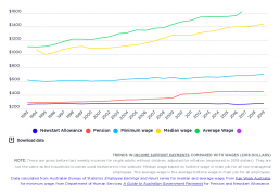
Trends in the single rate of Newstart Allowance (now JobSeeker), pensions and wages
This contrasts changes in the maximum weekly rates of Newstart Allowance and Pensions for single adults with changes in full time wages (both median and average measures) between 1993 and 2019. The ‘real’ value of pensions rose from $283 per week to $437, an increase of 56%, while Newstart rose from $250 to $270 (largely due to ‘compensation’ for the GST, and the energy supplement compensating for higher energy prices), an increase of just 8%. The main reasons for this disparity were that, unlike pensions, Newstart Allowance is only indexed to consumer prices and not wage movements (and was not increased in ‘real terms’ since 1994), and that Allowance recipients missed out on the $32pw increase in the pension rate in 2009. Over this period the gap between the two payments increased from $33 to $171 per week. The graph also shows that the minimum wage has progressively fallen behind both median (middle) and average fulltime wages. You can find out more about the changes in income…
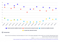
Reduction in inequality due to the social security and income tax systems
This tracks the impact of the income support and income tax systems on household income inequality in Australia, using the Gini Coefficient. The bottom lines show the impact on inequality of the social security system – the difference between private income and gross income. The top lines show the impact on inequality of the income tax system – the difference between gross income and disposable income. Social security payments have a greater overall impact on inequality (ranging from a 9.4% to 11.6% reduction in the Gini for weekly income) than income tax does (ranging from a 4.3% to 5.8% reduction). The impact of social security on inequality decreased in the years before 2008 (represented by the rise in the bottom row), increased shortly afterwards (represented by the fall in the bottom row), then declined after 2011. The impact of social security on inequality is influenced by three main factors: (1) Changes in the share of recipients in the overall population This is shown here.…
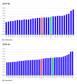
Level of income inequality in OECD countries
These charts compare overall income inequality in OECD countries, using the Gini coefficient, for which a higher score represents greater inequality. 2019-20: The chart shows that income inequality in Australia in 2021 or latest available date is close to the average level for wealthy nations, based on OECD data. 2017-18: The chart shows that income inequality in Australia in 2018 - the latest date for which comparative data is available - was close to the average level for wealthy nations. 2015-16: It shows that income inequality in Australia in 2015 – the latest date for which comparative data is available – was higher than the OECD average. Australia sits between other English-speaking countries, above Canada but below the United States and the United Kingdom; and alongside some countries with lower income levels, like Greece and Portugal. Most European countries had much lower income inequality than Australia.
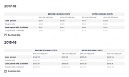
Poverty Lines by family type
This shows relative poverty in Australia using poverty lines of 50% and 60% of national median household income. More information on the definitions of poverty and different ways of measuring poverty can be found on our poverty page and our FAQ page. It also shows the poverty lines before and after housing costs are taken into account. Housing costs vary considerably among households, depending on whether those households are owners, purchasers or tenants and what part of Australia those households live in. In order to take into account the varying costs of housing, a separate set of ‘after housing costs’ poverty lines is used. This set is created by removing housing costs from disposable income before calculating the median income. This is a measure of the income required to pay for essentials other than housing. 2017-18: The table shows that the poverty line in 2017-18 for a single adult based on disposable income with no allowance for housing costs (the ‘before housing costs’…

Number of people below the poverty line
This table shows the number and percentage of people who live below the 50% and 60% of median income poverty lines in 2015-16 and 2017-18. It also shows the ‘poverty gap’, a measure of the depth of poverty for those living below the poverty line (the average gap between the incomes of people in poverty and the poverty line). It is important to measure poverty gaps, because even if the rate of poverty is reduced, this could still leave many people living well below the poverty line. 2017-18 After taking account of housing costs, over one in eight people (13.6%) live below the 50% of median income poverty line. The poverty rate among children is much higher, over one in six children (17.7%). The poverty rate among young people (aged 15-24) is 13.9%. There are 3,239,000 people living in poverty in Australia. This figure includes 774,000 children and 424,800 young people. The ‘poverty gap’ is 42% of the poverty line, or $282 a week. That is, people below the poverty line have incomes…
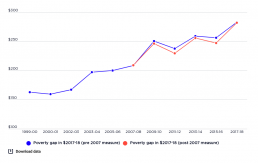
Trends in the poverty gap
This graph shows the average poverty gap for all people living below the poverty line, in dollars per week. These figures are indexed for inflation and are expressed in constant 2017-18 values. They are not adjusted for household size, so the average poverty gaps are boosted by the bigger gaps for larger households. It shows that average poverty gaps increased after 2007.
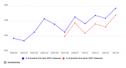
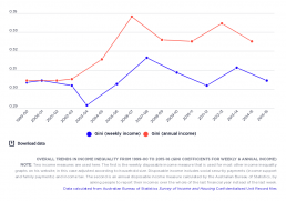
Trends in the poverty gap as a percentage of poverty line, 1999-00 to 2017-18
This graph measures the poverty gap (the average gap between the household incomes of those in poverty and the poverty line) as a percentage of the poverty line. It shows that the average gap between the household incomes of those in poverty and the poverty line rose from 34.3% of the poverty line in 1999-00 to 40.8% in 2003, fell in the boom years to 36.3% in 2007-08, then rose in sawtooth fashion to 44.2% in 2017-18. Broadly speaking, this is the opposite pattern to the trends in poverty rates. This reflects the changing composition of households below the poverty line. For example, a growing number of older people fell below the poverty line during the boom years from 2003 to 2007, but (relative to others in poverty such as people on Newstart Allowance) their average incomes were not as far below the line. The 2009 pension increase lifted many older people above the poverty line, increasing the share of people below the line with much lower incomes.
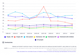
Trends in poverty rates by family type and age
This graph compares trends in poverty according to family type and age, between 1999-00 – 2015-16. It shows that, over this period, poverty rates were consistently higher for single people and sole parents than for partnered families. It also shows that poverty rates for people aged 65 and more, and for sole parents, were more variable than for other family types. The main shifts over the period are a decline in poverty among single people aged 65 and over; and a rise in poverty among partnered people, no matter their age. Poverty rates for single people fluctuated considerably more than for partnered people, especially for single people aged 65 and over, in part reflective of the closeness of single pension rates to the 50% median income poverty line.