
Comparison of income support payment rates and poverty lines
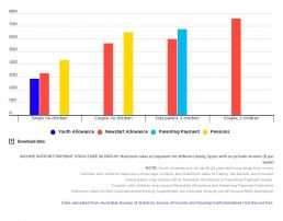
[infogram id="_/I3NcQQUxo5RWbDHkGtCa" prefix="fnx" format="interactive" title="Fig.17_Social security payment structure in 2015-16: maximum rates of payment for different family types with no private income ($ per week)."] Government payments in Australia include income support payments for adults in low income households (divided into the higher pension payments such as Age Pension and lower allowance payments such as Newstart Allowance), Family Tax Benefits for children in low and middle-income families, and supplementary payments such as Rent Assistance for private tenants in low-income households. This graph illustrates the rate structure that applied in 2015-16.
Trends in poverty, all people, 1999-00 to 2017-18
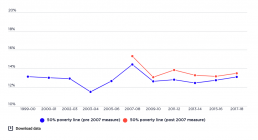
[infogram id="_/ypSowuzIsLYD4473YkFl" prefix="Qaz" format="interactive" title="Percentage of all people in poverty from 1999 - 2017"] This graph shows the poverty rates, after housing costs have been deducted, as a percentage of all people from 1999-00 to 2017-18. Whilst we focus on the consistent estimates based on the pre-2007 measure by the ABS (lower line), this graph also includes the higher poverty rates derived from the 2007-08 ABS income measure (upper line). The graph shows how the overall poverty rate fluctuated within a band between 11.5% and 14.5% between 1999-00 and 2017-18. Poverty declined substantially from 13.1% in 1999 to 11.5% in 2003, rose sharply during the boom years to 14.4% just before the Global Financial Crisis (GFC) in 2007, declined to 12.6% in 2009, and since then has risen modestly to 13.1% in 2017-18.
Trends in poverty - children, 1999-00 to 2017-18
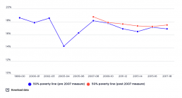
[infogram id="_/B9ifB7d9gPDfd9ow2T4i" prefix="qAf" format="interactive" title="Percentage of all children in poverty from 1999-2017"] This graph shows the poverty rate amongst children, after housing costs have been deducted, as a percentage of all children. It shows that poverty among children (people aged under 15 years) has moved within a higher band than overall poverty, fluctuating between 14.3% and 18.6% from 1999-00 to 2017-18. Before the Global Financial Crisis (GFC) in 2007, it followed a similar path to the overall poverty rate, declining substantially from 18.6% in 1999-00 to 14.3% in 2003-04, and rising sharply between from 2003-04 to 18.1% in 2001-02. After the GFC, however, the path of child poverty diverged from that of overall poverty. It fell only slightly to 17.8% in 2009-10, declined further to 16.5% in 2013-14, then rose to 16.9% in 2017-18
Trends in income support payments compared with wages
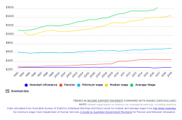
[infogram id="_/oPpZqcAZ5xL6HtnhQS4R" prefix="HCT" format="interactive" title="Fig.33_Trends in social security payments compared with wages"] This graph compares the single maximum rate of Newstart Allowance and pension payments with wages, represented by the minimum wage, average weekly full-time earnings and the median full-time wage, in 2018 dollars. It shows that the gap between the Newstart Allowance and single pension rates, as well as average and median wages, has grown over time.
Profile of each income group by age
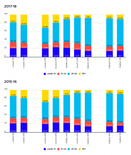
This graph shows the make-up of each income group by age. [infogram id="_/eDbRF9QdpI3mCfj46LMV" prefix="Fyc" format="interactive" title="2023-fig2_Profile of each income group by age"] 2019-20: The largest age-group in every income group are 25-64 year olds, as they have a greater share of the population as a whole. However, the lowest income group comprises almost a third of older people, while they comprise only 8% of the highest income group. 2017-18: The largest age-group in every income group are 25-64 year olds, reflecting their greater share of the overall population. However, older individuals are over-represented (66%) in the lowest 40% income group, as are children aged under 15 (45%). Almost half (48%) of people of working age, 25-64 years, were in the highest 40% income group, reflecting that age group’s larger size and greater earning capacity. 2015-16: The largest age-group in every income group are 25-64 year olds. However, older individuals are over-represented (29%)…
Trends in average wealth
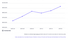
[infogram id="_/y82cwAVmMk95OG13RsZq" prefix="AGD" format="interactive" title="Fig.2_Trends in average wealth from 2002-03 to 2015-16 (000s of 2016 dollars)"] This shows changes in the real value (after inflation) of net household wealth. The average value of household wealth (minus debts such as home mortgages) rose steadily from $644,000 in 2003-04 to $836,000 in 2009-10, when the Global Financial Crisis occurred. Average wealth then dipped slightly to $802,000 in 2011-12 before rising again to $936,000 in 2015-16.
Rate of poverty by housing tenure
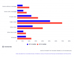
This graph shows the poverty rate of people by housing tenure –whether they own the house with or without a mortgage; whether they rent either privately or publicly; or whether they have another form of occupation type. [infogram id="f19172d1-0da4-4a73-a103-b6ef74bda4e3" prefix="d65" format="interactive" title="Fig.24_Rate of poverty by housing tenure (% of households)"] 2017-18: The graph shows that the risk of poverty is twice as great (19% using 50% median income poverty line and 28% using 60% median income poverty ine) for people in households renting privately than for home-owners (9% using 50% median income poverty line or 19% using median income poverty line) or home purchasers (9% using 50% median income poverty line or 13% using median income poverty line), reflecting the higher cost and/or lower incomes of people in private rental housing. 2015-16: The graph shows that households who rent privately have twice has much risk of poverty (at 21% using 50% median income poverty…
Poverty in Australia: A national perspective
Presentation to the 2019 NTCOSS conference by Jacqueline Phillips, Director of Policy and Advocacy, ACOSS: Poverty in Australia_A national perspective

Poverty in Australia 2018
Download this at https://www.acoss.org.au/wp-content/uploads/2018/10/ACOSS_Poverty-in-Australia-Report_Web-Final.pdf