
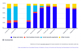
Profile of each income group by main source of household income
[infogram id="_/MacrY6mbHYgL7Gzs3R4H" prefix="tfn" format="interactive" title="Fig.20_Profile of each income group by main source of household income (2016)"] This graph shows the make-up of each income group according to their household’s main source of income. The majority (60%) of people in the lowest 20% income group live in households where the main income is social security payments. However, 40% of people in that income group live in households relying mainly on other income sources, including wages (26%), own business income (6%) and ‘other income’, mainly investments (8%). Towards the higher end of the income scale, 87% of those in the highest 20% income group are in households relying mainly on earnings, and none are in households relying mainly on social security. However, even higher up the scale an increasing share of people live in households rely mainly on investment income – from 9% of the highest 20% income group, to 14% of the highest 10% income group, and 17% of…
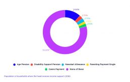
Population in households where the head receives income support (2016)
[infogram id="_/VUfd6ipGsl04uAr5VN4c" prefix="k7i" format="interactive" title="Fig.21_Population in households where the head receives income support (2016)"]
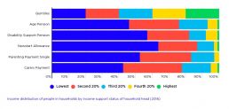
Income distribution of people in households by income support status of household head (2016)
[infogram id="_/5sZocYMRvR4f3rszzi34" prefix="m66" format="interactive" title="Fig.22_Income distribution of people in households by income support status of household head (2016)"]
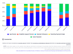
Profile of each household income group by income support status
[infogram id="_/DrcvqkoqGc5BVihccwTs" prefix="qHX" format="interactive" title="Fig.23_Profile of each income group by income support status of household head (2016)"] Unlike most other graphs in this website, this one is limited to the 21% of people (including children) living in households where the reference person (usually the highest income-earner) receives an income support payment. Its purpose is to compare the types of income support payments received in low, middle and high household income groups. Among people towards the lower end of the income scale, there is an increasing proportion of households where the reference person receives Newstart Allowance People in households whose reference person receives Newstart Allowance comprise 16% of the lowest 20% income group; 30% of the lowest 10% income group; and 47% of the lowest 5% income group. The reasons for the greater concentration of people in households receiving Newstart Allowance in the lowest income groups are that…
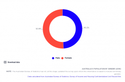
Australia’s population by gender
[infogram id="_/qiwOTRrkdnmIRm5JFE1Q" prefix="Vcm" format="interactive" title="Fig.4_Australia’s population by gender (2016)"] Those identifying as female comprise 51% of the population, while those identifying as male comprise 49% of the population.
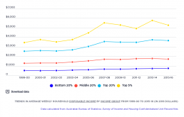
Trends in average weekly after tax income
[infogram id="_/quPnpB1KDsdQgxWYEsyr" prefix="9np" format="interactive" title="Fig.3_Trends in average weekly after tax income from 1999-00 to 2015-16 (in 2016 dollars)"] This shows how average household incomes grew in ‘real terms’ (after inflation) for the lowest, middle and highest 20% income groups in Australia, as well as the highest 5%. It shows that income growth was very uneven during the boom from 2000 to 2008. The average income of the lowest 20% grew by 5.6% per year in real terms, compared with 5.9% for the middle 20%, 7.2% for the highest 20%, and 10.3% for the highest 5%. After the GFC, from 2008 to 2016, household incomes grew much more slowly and less unequally. The average household incomes of the lowest 20% grew by 2.5% per year (aided by a large pension increase in 2009), compared with 0.3% for the middle 20%, 0.8% for the highest 20%, and a decline of 0.6% for the highest 5% (likely due to falls in returns from investments.
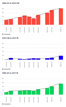
Annual percentage increase in weekly income, before and after the GFC in 2008
The graphs breaks the average annual increases in household income into two periods, before and after the Global Financial Crisis (GFC) and then shows the increase in income over the entire period 1999-00 to 2017-18. [infogram id="_/aGQNjGt8yAoexdTqUrp0" prefix="Uzc" format="interactive" title="2017-18: Figure 10_Annual percentage increase in weekly income, before and after the GFC in 2008"] It shows that the average incomes (after inflation) of the highest 20% rose by an average of 5.0% per year during the boom years, and 0.6% afterwards. The incomes of the middle 20% rose more slowly, by an average of 4.1% per year during the boom and 0.5% afterwards. The incomes of the lowest 20% grew more slowly again, by 3.9% a year in the boom up to 2007, but just 0.4% from 2007 to 2017-18. Over the period as a whole, average annual income growth (after inflation) was 2.7% for the highest 20%, compared wtih 2.2% for the middle 20% and 2% for the lowest 20%. The overall increase in incomes over…
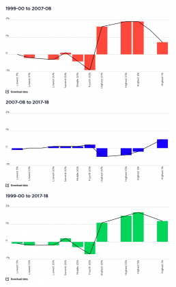
Changes in income shares before and after the GFC in 2008
This graph shows the changes in the share of household income to each income group before and after the Global Financial Crisis (GFC) and then shows the changes over the entire period 1999-00 to 2017-18. [infogram id="_/DvmKrR0aoXIOo5rQ3OCr" prefix="Sn0" format="interactive" title="2017-18: Figure 11_Changes in income shares (% of all income) before and after hte GFC in 2007-08"] Before the GFC, the share of the highest 20% group rose by 1.6%, while those of the middle and lowest 20% fell by 0.4% and 0.3% respectively. After the GFC, the share of the highest 20% fell by 0.5% while those of the middle and lowest 20% each rose by 0.1%. Over the whole period, the income share of the higest 20% increased by 1.1%, while that of the middle 20% and lowest 20%, whose shares fell by 0.3% and 0.2% respectively.
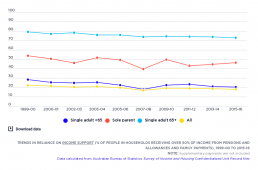
Trends in reliance on social security
[infogram id="_/0Kv0e4MppC9zd0Q2AnX1" prefix="Orm" format="interactive" title="Fig.7_Trends in reliance on income support (% of people in households receiving over 50% of income from pensions and allowances) 1999-2015"] The percentage of people in households relying mainly on social security for their income declined overall between 1999-00 and 2015-16, although the share of people of working age relying on these payments rose in 2007-08 due to the Global Financial Crisis. This long-term decline in social security reliance was due mainly to lower unemployment (before 2008), the closure of ‘pension’ payments for people between 50 and 64 years in the mid-1990s, ‘welfare to work’ policies that also restricted access to pension payments for people of working age (in 2007 and 2012), and growth in the private incomes of retirees (from superannuation, employment and other investments). You can find out more about changes in Australia’s income support system on our Causes and Solutions……
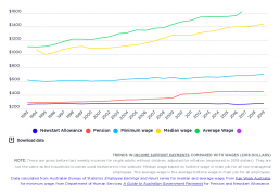
Trends in the single rate of Newstart Allowance (now JobSeeker), pensions and wages
[infogram id="_/oPpZqcAZ5xL6HtnhQS4R" prefix="HCT" format="interactive" title="Fig.33_Trends in social security payments compared with wages"] This contrasts changes in the maximum weekly rates of Newstart Allowance and Pensions for single adults with changes in full time wages (both median and average measures) between 1993 and 2019. The ‘real’ value of pensions rose from $283 per week to $437, an increase of 56%, while Newstart rose from $250 to $270 (largely due to ‘compensation’ for the GST, and the energy supplement compensating for higher energy prices), an increase of just 8%. The main reasons for this disparity were that, unlike pensions, Newstart Allowance is only indexed to consumer prices and not wage movements (and was not increased in ‘real terms’ since 1994), and that Allowance recipients missed out on the $32pw increase in the pension rate in 2009. Over this period the gap between the two payments increased from $33 to $171 per week. The graph also shows that the…