
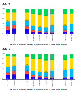
Profile of each income group by family type
This graph shows the make-up of each income group by family type. [infogram id="_/d9KgYeaVjQvDQQxATvuI" prefix="j1r" format="interactive" title="Fig.8_Profile of each income group by family type (2016)"] 2017-18: The graph shows that 42% of people in the lowest 20% income are single, either with or without children, compared with only 8% of those in the highest 20% income group. a majority of people in the lowest 20% income group are in couple families (55%). 2015-16: The graph shows that 32% of people in the lowest 20% income group are single, either with or without children, compared with only 8% of those in the highest 20% income group. A majority of people (57%) in the lowest 20% income group are in couple families, a reflection of their greater share (64%) of the overall population.
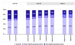
Profile of each income group by country of birth of adults
This chart shows the profile of each income group by the country of birth of adults within that group. A clear majority of people in all income groups were born in Australia, reflecting their high proportion (69%) of the overall population. 2019-20 Almost a third of (31%) of adults in the lowest 20% of incomes were born outside Australia in a country other than a major English-speaking country. 2017-18 29% of adults in the lowest 20% income group were born outside Australia in a non English-speaking country, while 69% of those in the highest 20% income group were born in Australia. 2015-16 Among those in the lowest 20% income group, 25% were born in a non English-speaking country. In contrast, 72% of those in the highest 20% were Australian born and only 15% were from non-English speaking countries. [infogram id="_/fN37KyOPIAxsl1igQnts" prefix="Bk5" format="interactive" title="2024_Fig8_Income profile by country of birth"]
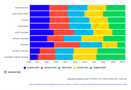
Income distribution of people by State/Territory
[infogram id="_/JXfPtXZqijpJczJVfkQW" prefix="dUs" format="interactive" title="Fig.12_Income distribution of people by State/Territory (2016)"] This graph shows where people living in different States and Territories are placed in the household income rankings. It shows that the States with the largest populations - New South Wales, Victoria and Queensland –have a more even representation of people across the income distribution than the smaller states and territories (the exception being the high share of people in the highest 20% - 23% - living in New South Wales, most of whom are likely to live in Sydney – link to graph). The smaller States and Territories have a greater concentration of people towards the highest or lowest ends of the income spectrum. For example, 25% of people living in Tasmania and South Australia are in the lowest 20% income group, while 23% of people in Western Australia and around 30% of people in the Territories are in the highest 20% income group. These…
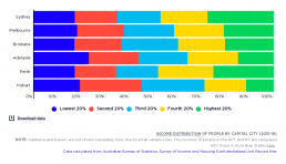
Income distribution of people by capital city
[infogram id="_/uskDxX0rhf8MgK1GvxAT" prefix="XTU" format="interactive" title="Fig.13_Income distribution of people by capital city (2016)"] This graph shows where people living in different capital cities are placed in the household income rankings. People living in Sydney (28%) or Perth (25%) are more likely to be in the highest 20% income group. Conversely, residents of Adelaide (23%) were more likely to be found in the lowest 20% income group.
Income distribution of people outside capital cities
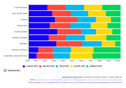
[infogram id="_/PPFaWgLcqIdcZjeYzTW2" prefix="ZTH" format="interactive" title="Fig.14_Income distribution of people outside capital cities (2016)"] This graph shows where people living in different capital cities are placed in the household income rankings. The highest shares of non-metropolitan residents in the lowest 20% income group are found in South Australia (31%), Tasmania (30%) and Victoria (28%). Both the Australian Capital Territory (31%) and Northern Territory (30%) have relatively high shares of people in the highest 20%.
Australia’s population by labour force status
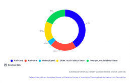
[infogram id="_/KpwpAB12X8GgmkBZn5tS" prefix="sVG" format="interactive" title="Fig.15_Australia’s population by labour force status (2016)"] Almost two-thirds (62%) of Australia’s adult population are employed: the majority in full-time paid work (41%), but also a significant portion (21%) in part-time jobs. Just over one-third (34%) of the adult population are not in the labour force ( mainly younger and older people), while 4% of the total adult population (as distinct from the labour force) is unemployed.
Income distribution of people in households by labour force status of household reference person
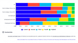
[infogram id="_/LQMvqg8oNhPMik0tTILf" prefix="EmC" format="interactive" title="Fig.16_Income distribution of people in households by labour force status of household head (2016)"] This graph shows where people are placed in the household income rankings, according to whether their household reference person (usually the member with the highest income) is employed, unemployed or not in the paid workforce. People in households where the reference person is either not in the labour force or unemployed are concentrated in the lowest 20% income group. Of all people in households where the reference person is unemployed, 77% are in the lowest 20%, along with 59% where the reference person is of working age but outside the paid workforce, and 42% where the reference person is 65 years or over and retired. On the other hand, 29% of people in households where the reference person is employed full-time are in the highest 20%. Living in a household where the reference person is employed…
Profile of each income group by labour force status of household reference person
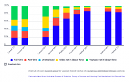
[infogram id="_/6x9dwIyQiXqVCl80hv6K" prefix="MtJ" format="interactive" title="Fig.17_Profile of each income group by labour force status of household head (2016)"] This graph shows the make-up of each income group according to whether their household reference person (usually the member with the highest income) is employed, unemployed or not in the paid workforce. Household members whose reference person is unemployed form a larger share of income groups as we move down the income scale. They represent 7% of the lowest 20% income group; 10% of the lowest 10% income group, and 13% of the lowest 5% income group. This is echoed in households where the reference person is of working age and is not part of the paid workforce, which comprise 28% of the lowest 20% income group, 34% of the lowest 10% income group, and 35% of the lowest 5% income group. The lowest 20% income group mainly comprises households where the reference person is out of the paid workforce: 30% where the reference…
Population by main source of household income
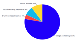
This chart shows the main sources of household income in Australia. [infogram id="_/JqKvaOLmDMkMjRrdiKwW" prefix="5R6" format="interactive" title="Main source of household income 2023"] 2019-20: Wages and salaries were the largest income source (77% of all income), followed by investment and other income (10%), social security payments, including Family Tax Benefits (8%), and own-business income (4%). 2017-18: The main source of household income is wages and salaries, at 75%. Of the remainder, 8% are social security payments, 5% self employed and 12% from other sources (mainly investments). 2015-16: For most people in Australia, the main source of household income is wages and salaries, at 69%. Of the remainder, 18% are in households relying mainly on social security payments, 5% on income from self-employment and 8% from other sources (mainly investments).
Income distribution of people in households by main income source
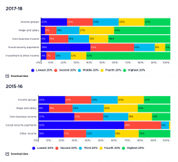
This graph shows where people are placed in the household income rankings, according to their household’s main source of income in 2015-16 and 2017-18. Social security payments include pensions, allowances and family payments. [infogram id="_/dDywdtssHktSN7SkXmyn" prefix="P2Z" format="interactive" title="2017-18: Fig.5_Income distribution of people in households by main income source"] 2017-18: The graph shows that the highest 20% income group receives two-thirds of all investment income and a substantial share of own-business income and wages (48% and 44% respectively). At the other end of the scale, the lowest 20% receives over a third of all social security income (38%). 2015-16: The graph shows that 65% of people in households that mainly rely on social security payments are concentrated in the lowest 20% income group. In contrast, people in households relying mainly on wages or salaries are more likely to be found at the higher end of the distribution (with 51% in the highest 40%…