

Heart, stroke and vascular diseases, diabetes and arthritis by income group
[infogram id="_/v7BFxL4YM34SEVspGB4b" prefix="9EG" format="interactive" title="Chronic conditions 1_heart+diabetes+arthritis_ by income"] Those in lower income groups report higher levels of heart, stroke and vascular diseases, diabetes and arthritis than those in higher income groups.

Poverty and inequality primary and secondary education resources
Education resources, in partnership with Anti-Poverty Week Australia, prepared by Cool Australia. View them at: https://cool.org/poverty-and-inequality-education-resources

Quarterly asking median rent per week, houses
[infogram id="_/OG0cS8DrTfUaqW0RTY8Q" prefix="JE6" format="interactive" title="Figure 4.11 quarterly median asking rent per week houses"] This graph shows that in every state capital except Hoabrt, the median asking rent for houses increased during the September quarter 2020 to at least the same level as before the pandemic; and in several cities increased to a greater level.
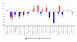
Change in median asking rents, quarter on quarter and year on year to June 2020
[infogram id="_/be00vY7THWxA0hDvPNQm" prefix="Lme" format="interactive" title="Figure 4.10 Change in median asking rents"] This graph compares hte decline in median advertised rents from both the first quarter of 2020 and the June quarter of 2019 for both houses and units in each of the state capitals, showing the immediate impact of the pandemic on unit rents in Sydney, Melbourne and Hobart. Only in Sydney and Melbourne did asking rents fall to lower than the median price for the same time the previous year. In contrast, the effect on median asking rents for houses was much smaller, barring Hobart. In Adelaide, Perth and Canberra, median asking rents remained higher than they had been during the June quarter of 2019.
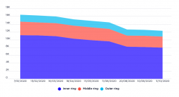
Airbnb listings for entire houses, Melbourne, January to October 2020
[infogram id="_/4XBohK9wv6rsW9PxaYK9" prefix="07j" format="interactive" title="Figure 4.9 Airbnb listings for entire houses Melbourne"] This graph shows the data for listings from InsideAirbnb for Melbourne during the period January to October 2020. It shows that listings for entire homes contracted by 22% since COVID-19 restrictions were introduced, equating to 3,661 dwellings that were presumably available previously for long term lease or purchase. The decline is most pronounced in the inner rings of Melbourne. It suggests that, while many of these properties might have been sold, re-occupied by owners, or left unoccupied, there was likely a substantial increase in the supply of longer term private rental properties in inner-Melbourne.
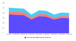
Airbnb listings for entire houses, Sydney, January to October 2020
[infogram id="_/hXNj18OkFGRLjP2tMKhL" prefix="qgY" format="interactive" title="Figure 4.8 Airbnb listings for entire houses Sydney"] This graph shows the data for listings from InsideAirbnb for Sydney during the period January to October 2020. It shows that listings for entire homes contracted by 17% since COVID-19 restrictions were introduced, equating to 4,317 dwellings that were presumably available previously for long term lease or purchase. The decline is most pronounced in the inner rings of Sydney. It suggests that, while many of these properties might have been sold, re-occupied by owners, or left unoccupied, there was likely a substantial increase in teh supply of longer term private rental properties in inner-Sydney.
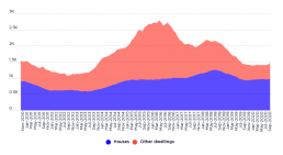
New private dwelling approvals, Greater Brisbane
[infogram id="_/ysDjqpnVzeFaUJvT89a6" prefix="nMA" format="interactive" title="Figure 4.7 New private dwelling approvals, Greater Brisbane"] This graph shows how apartments and units became the main source of new dwellings in the Greater Brisbane area over 2013-14 to 2015-16.
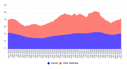
New private dwelling approvals, Greater Melbourne
[infogram id="_/vsCL2pcuFSeuAiAXkgPd" prefix="sJ2" format="interactive" title="Figure 4.6 New private dwelling approvals, Greater Melbourne"] This graph shows how apartments and units became the dominant source of new dwellings in Greater Melbourne over 2013-14 to 2015-16.