
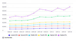
Trends in real average household disposable income
This graph shows the average annual growth in household after-tax incomes for each quintile from 1999-00 to 2019-20. [infogram id="_/4AcGK7i1Rs99VN0hqR1a" prefix="E95" format="interactive" title="2023_Trends in average weekly after tax income from 1999-00 to 2019-20 (in 2019 dollars)"] During the period up to 2007, growth in high incomes surpassed that of middle and lower-income households. The average after-tax incomes of the highest 20% rose by 40% from $2,658 per week in 1999 to $3,728 in 2007, compared with an increase of 32% from $1,348 to $1,784 for the middle 20% and an increase of 31% from $535 to $700 for the lowest 20%. The highest 5% of households saw their incomes grow even more strongly during the boom, from $3,620 a week to $5,773, a steep 59% increase. After the Global Financial Crisis (GFC) in 2008, growth in household incomes flatlined, along with income inequality. The average after-tax incomes of the highest 20% rose by 4% from $3,728 in 2007 to $3,895 in 2019-20,…
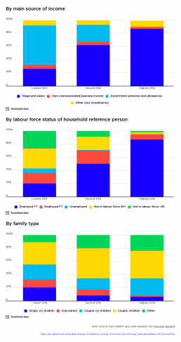
Who sits in the lowest 40% and top 20%?
[infogram id="_/KSuFVggwzsMNq1wypzo5" prefix="dwC" format="interactive" title="Fig.3_Who sits in the lowest 40% and top 20%?"] This shows what kinds of households sit in the highest, middle and lowest 20% household income groups, by main income source and the employment status of the household reference person (usually the household member with the highest income). It shows that most people in the lowest 20% are in households that rely mainly on government pensions and allowances (60%) for their income. Unsurprisingly, most (58%) of people in the lowest 20% belong to households in which the reference person is not in the labour force (for example, retired, has a disability, or caring for a family member)Another 7% are in households whose reference person is unemployed. More surprisingly, 20% of the lowest income group are in households whose reference person is employed full time. These are mainly families with children, since we have adjusted their household incomes downwards to…
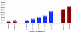
Average weekly disposable income
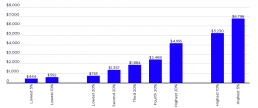
These charts show average weekly household incomes (including social security payments and after tax has been deducted), by household income group in 2015-16 and 2017-18. For this purpose, individuals have been divided into five equal groups ranked by household income. At the highest and lowest ends of the income scale, extra columns have been added to show the average household incomes of the highest and lowest 10% and 5%. [infogram id="_/xFFrbRKngRI6gFb6WFLu" prefix="d9p" format="interactive" title="Average weekly disposable income by household income group_2023"] 2019-20: The highest 20% income group received $4,306 per week after tax ($305,000 per year before tax) twice the disposable income of the middle 20% ($1,989 per week or $122,000 per annum) and five times that of the lowest 20% ($794 per week or $43,000 per annum). The highest 5% (with $6,495 per week or $569,000 per annum) had three times the disposable income of the middle 20% and eight times that of the lowest 20%.…
Average weekly disposable income
This content is password-protected. To view it, please enter the password below. Password:
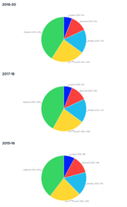
Shares of national household disposable income
This shows how all household income in Australia is shared among five groups ranked by income, each comprising 20% of the population. [infogram id="_/DxXIeK0wiV2DHZ72IesM" prefix="61O" format="interactive" title="Fig 2 - shares of national household income_2023"] 2019-20: In 2019-20, the 20% of people in the highest income group received 41% of all household income in Australia. This was more than that received by the middle 20%, which received 17% of all household income. Those in the lowest 20% received only 6% of all household income, while those in the second lowest income group received 12% of all household income. 2017-18: In 2017-18, the 20% of people in the highest income group received 42% of all household income in Australia. This was more than that received by the lowest 3 income groups, who received 35% of all household income. Those in the lowest 20% received only 6% of all household income, while those in the second lowest income group received 12% of all household…
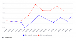
Overall trends in income inequality
This graph shows the overall trends in income inequality from 1999-00 to 2017-18 using the Gini coefficient by both weekly and annual income. A higher Gini represents greater overall inequality. [infogram id="_/4ya4awFChHjirrYjgcKG" prefix="wmB" format="interactive" title="2017-18: Fig.8_Overall trends in income inequality from 1999-00 to 2017-18 (Gini coefficients for weekly & annual income)"] When the weekly income measure is used, the Gini rises from 0.304 to 0.319 between 1999-00 and 2007-08 and ends up at 0.315 in 2017-18. When the annual income measure is used, inequality increases more sharply from 0.305 in 1999-00 to 0.344 in 2007-08, falling back to 0.329 in 2014-15. In theory, we would expect the Gini coefficient for annual income to be lower than that for weekly income, as incomes are smoothed out throughout the year. One explanation for the higher Gini for annual incomes is that fluctuating one-off incomes such as dividends and capital gains were…
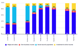
Main income source of each income group
This chart shows the main sources of household income for people ranked by the income of their households. [infogram id="_/v4nMGQfR63iUiEc55pXF" prefix="gCx" format="interactive" title="2023 Main income source of each income group (%)"] 2019-20: Wages and salaries contributed most of the before-tax income of all income groups except the lowest 20%. Social security payments comprised half the income (50%) of the lowest 20% but contributed less than 10% of the incomes of the highest 60% of households. Investment income only contributed a sizeable share of the incomes of the highest income groups. For example, it contributed 23% of the income of the highest 5%. 2017-18: Wages and salaries represent the main source of income for all income groups except the lowest. Social security payments are the largest income source for the lowest 20% (54% of their income) but these payments comprise 25% or less of total income for all higher-income groups. Investment income only forms a sizeable…
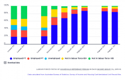
Labour force status of household reference person in each income group
[infogram id="_/bijXtOGWCrcfwiG5LHZ1" prefix="nBF" format="interactive" title="Fig.2_Labour force status of household reference person in each income group (%), 2015-16"] This shows the employment status of all adults in each of the income groups. Only 24% of adults in the lowest 20% have paid employment, and less than half of these workers are in full-time jobs. In the middle 20%, 68% of adult household members are employed, with 42% of these workers in full-time jobs. Typically in these households there is a primary income-earner in full-time paid work and a secondary income-earner in part-time paid work. Within the highest 20%, 87% of adult households members have paid work, with 67% of them in full-time jobs. This suggests that these households are more likely than the middle 20% group to have two full-time wage earners.
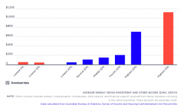
Average weekly before-tax investment and other income
[infogram id="_/DlDKCoP9IsoarjoNQP74" prefix="pal" format="interactive" title="Fig.4_Average weekly before-tax investment and other income, $pw in 2015-16"] This graph shows the average weekly income received by the various income groups from investment and ‘other income’. The majority of people live in households that receive little or no income from investments, while a few receive large amounts. The middle 20% had an average of $150 per week from investments and other private sources, while the highest 20% had almost five times as much ($705) and the highest 5% had almost eight times as much ($1,125). As a result, despite being a small share of overall income, investment income contributes substantially to overall income inequality.
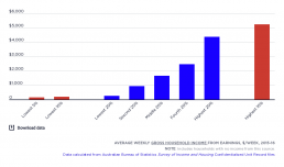
Average weekly gross household income from wages
[infogram id="_/nzCaME3QEWvFulNgRcxe" prefix="itt" format="interactive" title="Fig.3_Average weekly gross household income from wages, $pw in 2015-16"] This shows average weekly incomes from wages (before tax) in each of the income groups. The highest 20% of households receives almost three times the average wages of the middle income group (averaging $4,363 per week before tax compared with $1,645), while the middle 20% receives six times as much as the lowest 20% ($1,645 compared with $256). Differences in average earnings received by household income groups are the result of variations in the proportion of people employed in different household income groups and the number of hours they work (see this graph), and their hourly pay.