
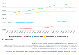
Trends in the single rate of Newstart Allowance (now JobSeeker), pensions and wages
[infogram id="_/oPpZqcAZ5xL6HtnhQS4R" prefix="HCT" format="interactive" title="Fig.33_Trends in social security payments compared with wages"] This contrasts changes in the maximum weekly rates of Newstart Allowance and Pensions for single adults with changes in full time wages (both median and average measures) between 1993 and 2019. The ‘real’ value of pensions rose from $283 per week to $437, an increase of 56%, while Newstart rose from $250 to $270 (largely due to ‘compensation’ for the GST, and the energy supplement compensating for higher energy prices), an increase of just 8%. The main reasons for this disparity were that, unlike pensions, Newstart Allowance is only indexed to consumer prices and not wage movements (and was not increased in ‘real terms’ since 1994), and that Allowance recipients missed out on the $32pw increase in the pension rate in 2009. Over this period the gap between the two payments increased from $33 to $171 per week. The graph also shows that the…

Reduction in inequality due to the social security and income tax systems
[infogram id="_/GHRuc11fIziNCKG63Wzw" prefix="hTD" format="interactive" title="Fig.6_Reduction in inequality due to the social security and income tax systems"] This tracks the impact of the income support and income tax systems on household income inequality in Australia, using the Gini Coefficient. The bottom lines show the impact on inequality of the social security system – the difference between private income and gross income. The top lines show the impact on inequality of the income tax system – the difference between gross income and disposable income. Social security payments have a greater overall impact on inequality (ranging from a 9.4% to 11.6% reduction in the Gini for weekly income) than income tax does (ranging from a 4.3% to 5.8% reduction). The impact of social security on inequality decreased in the years before 2008 (represented by the rise in the bottom row), increased shortly afterwards (represented by the fall in the bottom row), then declined after 2011. The…
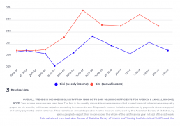
Overall trends in income inequality from 1999 to 2015
[infogram id="_/sfN2lfV06jGgu0YfuMcu" prefix="Qyv" format="interactive" title="Fig.2_Overall trends in income inequality from 1999-00 to 2015-16 (Gini coefficients for weekly & annual income)"]
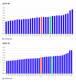
Level of income inequality in OECD countries
These charts compare overall income inequality in OECD countries, using the Gini coefficient, for which a higher score represents greater inequality. [infogram id="_/zSlYrwklEeO2NV0TWy5e" prefix="bQJ" format="interactive" title="2023: International comparison of income inequality"] 2019-20: The chart shows that income inequality in Australia in 2021 or latest available date is close to the average level for wealthy nations, based on OECD data. 2017-18: The chart shows that income inequality in Australia in 2018 - the latest date for which comparative data is available - was close to the average level for wealthy nations. 2015-16: It shows that income inequality in Australia in 2015 – the latest date for which comparative data is available – was higher than the OECD average. Australia sits between other English-speaking countries, above Canada but below the United States and the United Kingdom; and alongside some countries with lower income levels, like Greece and Portugal. Most…
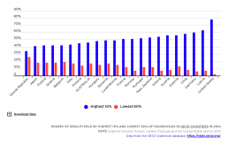
Household wealth distribution in OECD nations
[infogram id="_/qVhg7lrbYnQCgXJIgcw1" prefix="rLy" format="interactive" title="Fig.4_Wealth distribution in OECD nations in 2014"] In 2014, wealth was less unequally distributed in Australia than on average throughout the OECD, with 46% of household wealth in Australia held by the top 10% of households ranked by wealth. In contrast, income inequality is greater in Australia than in most OECD nations.
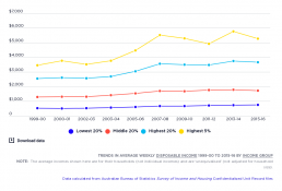
Trends in average weekly disposable income since 1999-00
[infogram id="_/GBas3Lc2Ku0noMRYn4jm" prefix="kcc" format="interactive" title="Fig.5_Trends in average weekly disposable income 2000 to 2016 (in 2016 dollars)"] This shows how average household incomes grew in ‘real terms’ (after inflation) for the lowest, middle and highest 20% income groups in Australia, as well as the highest 5%. It shows that income growth was very uneven during the boom from 1999-00 to 2007-08. The average income of the lowest 20% grew by 5.6% per year in real terms, compared with 5.9% for the middle 20%, 7.2% for the highest 20%, and 10.3% for the highest 5%. After the Global Financial Crisis, from 2007-08 to 2015-16, household incomes grew much more slowly and less unequally. The average household incomes of the lowest 20% grew by 2.5% per year (aided by a large pension increase in 2009), compared with 0.3% for the middle 20%, 0.8% for the highest 20%, and a decline of 0.6% for the highest 5% (likely due to falls in returns from investments.
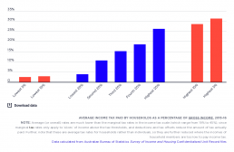
Average income tax paid by households
[infogram id="_/Ea6RLDekvwAqZpqCE5ZM" prefix="lWC" format="interactive" title="Fig.6_Average income tax paid by households as a % of gross income, 2015-16"] This shows the average (not marginal) tax rates paid by households (not individuals) in different income groups. Personal income taxes are progressive, so average tax rates increase with income. Households in the lowest 20% pay only 4% of their overall income in income taxes on average (including the Medicare Levy) compared with 15% for the middle 20% and 26% for the highest 20%. However, the progressive impact of income taxes is largely offset by the regressive impact of other taxes such as the Goods and Services Tax and Stamp Duties. Find out more.
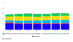
Trends in wealth inequality by asset type
[infogram id="_/pLLmrjoss723BOzvS5ux" prefix="XO8" format="interactive" title="2017-18: Fig.20_Trends in wealth inequality (gini coefficient) by asset type from 2003-04 to 2017-18"] This graph shows the contribution of each asset class to overall wealth inequality, and how this changed over time. The sum of these contributions is the Gini coefficient for each year, which rose from 0.57 in 2003-04 to 0.62 in 2017-18. It also shows the contribution of different components of household wealth (asset classes) to overall wealth inequality. The three asset classes making the greatest contributions to wealth inequality at the end of the period in 2015-16 (when the Gini coefficient was 0.62) were owner-occupied housing (contributing 0.22, reflecting its high overall weight among household assets), shares and business income (contributing 0.15, reflecting its high concentration in high-wealth households), and superannuation (contributing 0.12, reflecting its high overall weight among household…
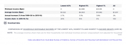
Comparison of household disposable incomes
[infogram id="_/TcScbui4fV9kD1qlO8Yg" prefix="y1D" format="interactive" title="Table 1_Comparison of incomes of the bottom 40%, top 1% and top 5% (2015-16)"] This table compares the minimum and average household incomes of the lowest 40% income group, the highest 5% and the highest 1%. In 2015-16, the average household income of the highest 1% was $11,682 per week, over ten times the average disposable income of the lowest 40% , which was $1,022 per week. Their incomes were almost twice that of the highest 5% and almost six times the overall average household disposable income ($2,033). The incomes of the highest 1% of households also increased more rapidly. Between 1999-00 and 2015-16, their average incomes rose 15% faster than the incomes of households in the highest 5%; and 42% faster than the lowest 40%.
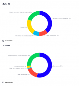
Components of Australia’s wealth
Ths graph shows the parts of Australia's wealth. [infogram id="_/OW0OGoFSiCC4l3IVwCVu" prefix="xD9" format="interactive" title="2017-18: Fig.14_Components of Australia’s wealth"] 2017-18: 39% of household wealth is held in owner-occupied housing, 12% in investment property, 21% in superannuation another 20% in shares and other financial assets (such as bonds and bank accounts), and 9% in other non-financial assets such as cars. 2015-16: A large component of Australia’s household wealth (39%) is held in the family home, followed by 20% in superannuation , and 19% in financial assets such as shares and business assets. Around 12% is held in other real estate – investment properties - and 10% in other non‑financial assets such as vehicles and home contents.