
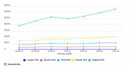
Trends in average wealth by wealth group
This chart shows the real value (after inflation is taken into account) of average wealth holdings of each wealth group, compared over time. [infogram id="_/51MQ2FcUK1NbokAkbwvC" prefix="zTW" format="interactive" title="2017-18: Fig.21_Trends in average wealth by wealth group from 2002-03 to 2015-16 (000s of 2016 dollars)"] As with income inequality, changes in wealth inequality were driven mainly by the highest 20% wealth group, although this growth was more volatile than for middle and low wealth groups. This was due in part to the greater share of the wealth of the highest 20% held in financial assets such as shares. The average household wealth of the highest 20% rose from $1.9 million in 2003-04 to $2.6 million in 2009-10, declined to $2.4 million in 2011-12 and rose again to $3.255 million in 2017-18.

Increase in average wealth by wealth group
[infogram id="_/DXwhDVpKjLxkxdF1UQWL" prefix="ZgV" format="interactive" title="2023_increase in average wealth by wealth group v2"] This graph compares the increase in real value (after inflation is taken into account) of average wealth holdings of each wealth group. Between 2003-04 and 2022-23: The average wealth of the highest 20% wealth group rose by 82%. The average wealth of the middle 20% wealth group rose by 61% The average wealth of the lowest 20% wealth group rose by 20%.
Change in share of overall wealth by wealth group
[infogram id="_/TfznlPfDwnU5SScrrJtO" prefix="jYL" format="interactive" title="2023_change in share of overall wealth by wealth group V2"] This charts hows how the share of all wealth held by different groups changed from 2003 to 2022. The share of the wealthiest 20% grew by 2.7 percentage points, while that of the middle 20% declined by 1 percentage point and that of the lowest 20% fell by 0.3 of a percentage point.

Change in shares of overall wealth by wealth group
This shows changes in the shares of overall household wealth held by each wealth group. [infogram id="_/JNFGRm7KnztFQIFqH9Rm" prefix="7hv" format="interactive" title="2017-18: Fig.23_Change in shares of overall wealth by wealth group, from 2003-04 to 2017-18 (%)"] Between 2003-04 and 2017-18, the highest 20% wealth group increased its share of overall wealth by 4.5%, while the share of all other groups declined. This represents an unambiguous increase in wealth inequality over the period.
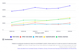
Trends in average household wealth in different assets
[infogram id="_/L9IpRLkDlq24qh6kR1eF" prefix="Acv" format="interactive" title="Fig.6_Trends in average household wealth in different assets, from 2003-04 to 2015-16 (000s of 2016 dollars)"] This shows compares the real value (after inflation is taken into account) of average wealth holdings in different assets. The average value of owner-occupied housing (the largest component of household wealth) rose strongly before the Global Financial Crisis, declined between 2009-10 and 2011-12, and then resumed its strong growth. Overall, the average value of owner-occupied housing rose by 28% (after inflation) during this period. The value of other real estate (investment property) followed a similar pattern. But grew much more strongly overall, by 61%. The average value of superannuation holdings grew very strongly and consistently across the period (by 119% overall), so that its share of wealth holdings increased. From 2003-04 to 2015-16, the share of owner-occupied housing in all household…
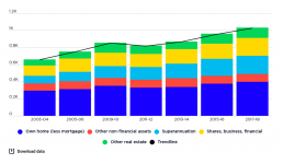
Trends in the concentration of wealth in different assets, from 2003-04 to 2017-18
[infogram id="_/oBP5G0M6HRz3FuVsE88V" prefix="chr" format="interactive" title="2017-18: Fig.19_Trends in wealth inequality (gini coefficient) by asset type from 2003-04 to 2017-18"] From 2003-04 to 2017-18, the overall value of household wealth rose by 56% after inflation, led by strong growth in the value of superannuation, shares and other financial investments, and investment property. In that time, the average value of superannuation held by households (including those who do not have it) rose by 141% from $89,000 to $214,000, shares and other financial assets rose by 74% from $121,000 to $210,000 and investment property rose by 66% from $71,000 to $119,000. The average value of the largest asset - owner-occupied housing - grew at a more modest 35% from $294,000 in 2003 to $398,000 in 2017, along with 8% growth in the value of other non-financial assets from $86,000 to $92,000.
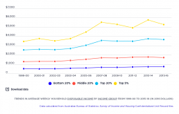
Trends in average weekly after tax income
[infogram id="_/quPnpB1KDsdQgxWYEsyr" prefix="9np" format="interactive" title="Fig.3_Trends in average weekly after tax income from 1999-00 to 2015-16 (in 2016 dollars)"] This shows how average household incomes grew in ‘real terms’ (after inflation) for the lowest, middle and highest 20% income groups in Australia, as well as the highest 5%. It shows that income growth was very uneven during the boom from 2000 to 2008. The average income of the lowest 20% grew by 5.6% per year in real terms, compared with 5.9% for the middle 20%, 7.2% for the highest 20%, and 10.3% for the highest 5%. After the GFC, from 2008 to 2016, household incomes grew much more slowly and less unequally. The average household incomes of the lowest 20% grew by 2.5% per year (aided by a large pension increase in 2009), compared with 0.3% for the middle 20%, 0.8% for the highest 20%, and a decline of 0.6% for the highest 5% (likely due to falls in returns from investments.
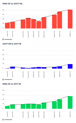
Annual percentage increase in weekly income, before and after the GFC in 2008
The graphs breaks the average annual increases in household income into two periods, before and after the Global Financial Crisis (GFC) and then shows the increase in income over the entire period 1999-00 to 2017-18. [infogram id="_/aGQNjGt8yAoexdTqUrp0" prefix="Uzc" format="interactive" title="2017-18: Figure 10_Annual percentage increase in weekly income, before and after the GFC in 2008"] It shows that the average incomes (after inflation) of the highest 20% rose by an average of 5.0% per year during the boom years, and 0.6% afterwards. The incomes of the middle 20% rose more slowly, by an average of 4.1% per year during the boom and 0.5% afterwards. The incomes of the lowest 20% grew more slowly again, by 3.9% a year in the boom up to 2007, but just 0.4% from 2007 to 2017-18. Over the period as a whole, average annual income growth (after inflation) was 2.7% for the highest 20%, compared wtih 2.2% for the middle 20% and 2% for the lowest 20%. The overall increase in incomes over…
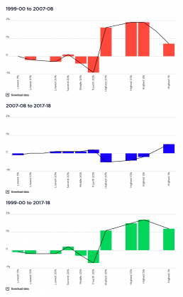
Changes in income shares before and after the GFC in 2008
This graph shows the changes in the share of household income to each income group before and after the Global Financial Crisis (GFC) and then shows the changes over the entire period 1999-00 to 2017-18. [infogram id="_/DvmKrR0aoXIOo5rQ3OCr" prefix="Sn0" format="interactive" title="2017-18: Figure 11_Changes in income shares (% of all income) before and after hte GFC in 2007-08"] Before the GFC, the share of the highest 20% group rose by 1.6%, while those of the middle and lowest 20% fell by 0.4% and 0.3% respectively. After the GFC, the share of the highest 20% fell by 0.5% while those of the middle and lowest 20% each rose by 0.1%. Over the whole period, the income share of the higest 20% increased by 1.1%, while that of the middle 20% and lowest 20%, whose shares fell by 0.3% and 0.2% respectively.
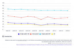
Trends in reliance on social security
[infogram id="_/0Kv0e4MppC9zd0Q2AnX1" prefix="Orm" format="interactive" title="Fig.7_Trends in reliance on income support (% of people in households receiving over 50% of income from pensions and allowances) 1999-2015"] The percentage of people in households relying mainly on social security for their income declined overall between 1999-00 and 2015-16, although the share of people of working age relying on these payments rose in 2007-08 due to the Global Financial Crisis. This long-term decline in social security reliance was due mainly to lower unemployment (before 2008), the closure of ‘pension’ payments for people between 50 and 64 years in the mid-1990s, ‘welfare to work’ policies that also restricted access to pension payments for people of working age (in 2007 and 2012), and growth in the private incomes of retirees (from superannuation, employment and other investments). You can find out more about changes in Australia’s income support system on our Causes and Solutions……