
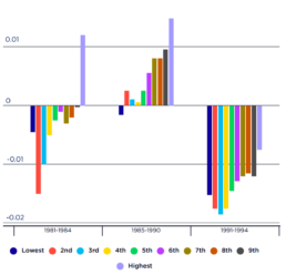
Impact of past recessions on household after-tax incomes
[infogram id="_/WP65tikBeaoXuw5ASAS9" prefix="QJJ" format="interactive" title="Figure 3_Impact of past recessions no household after-tax incomes (% change over each period)"] This figure shows changes in household after-tax incomes brought about by the recessions of the early 1980s and 1990s (left and right-hand clusters).
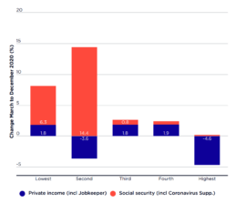
Changes in average before-tax income of households ranked by private income March-December 2020
[infogram id="_/qxrvFdhIeW4cATxHFZv7" prefix="HvQ" format="interactive" title="Figure 2_Change in average before tax income of households"] This graph shows that, from March 2020 to December 2020: * The average incomes of the lowest 20% income group (who mainly relied on pensions) rose by 8% ($56pw); * Those of the next 20% (mainly low-paid workers and families on income support) rose by 11% ($144pw); * The average incomes of the middle 20% rose by 3% ($53pw) and those of the next 20% rose by 2% ($67pw); * In contrast, the average incomes of the highest 20% fell by 4% ($230pw).
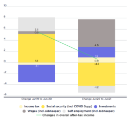
Change in household income (as a % of after-tax income in June 2019)
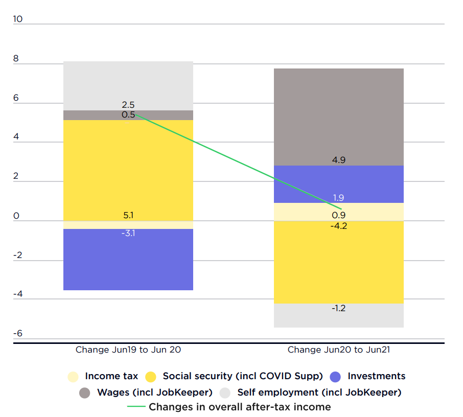 Source: Australian Bureau of Statistics, Australian National Accounts.
Note: Shows growth in different components of household income from June 2019 (before COVID) to June 2020 (recession), and from June 2020 to June 2021 (recovery), as a percentage of average after-tax household income in June 2019. Income tax is expressed in negative values (so a positive value means a reduction in tax). Note that the value of some components fell. Yellow = an increase would be expected to reduce inequality (more so if darker); Blue = an increase would be expected to increase inequality (more so if darker). Grey = an increase has an indeterminant impact on inequality.
This graph compares changes in the main components of household incomes in the…
Source: Australian Bureau of Statistics, Australian National Accounts.
Note: Shows growth in different components of household income from June 2019 (before COVID) to June 2020 (recession), and from June 2020 to June 2021 (recovery), as a percentage of average after-tax household income in June 2019. Income tax is expressed in negative values (so a positive value means a reduction in tax). Note that the value of some components fell. Yellow = an increase would be expected to reduce inequality (more so if darker); Blue = an increase would be expected to increase inequality (more so if darker). Grey = an increase has an indeterminant impact on inequality.
This graph compares changes in the main components of household incomes in the…
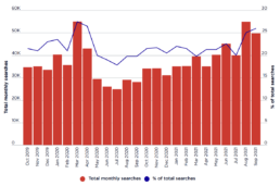
Internet searches for food assistance from October 2019 to September 2021
[infogram id="_/5if5bxex3dtdcECUonnF" prefix="mcJ" format="interactive" title="Figure 13_Internet searches, Australia"] This graph shows trends in internet searches for food relief from before the COVID recession in October 2019 to September 2021: It shows similar peaks in searches for food relief at the start of the national lockdown in March 2020 and those in Sydney, Melbourne and Canberra in August 2021, which were experiencing lockdowns at the time. Significantly, demand fell between March and July 2020 as COVID income supports were introduced, and gradually rose through 2021 after they were removed.
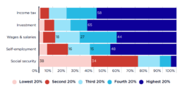
Distribution of income by source (percentage of all income)
This chart shows how the distribution of income by source is distributed unevenly across the household income groups. [infogram id="_/CUd6TdpsI9SKISE7jjjj" prefix="tCS" format="interactive" title="2023 Income distribution of people in households by main income source"] 2019-20: The highest 20% received 59% of all investment income and a substantial share of own-business income and wages (47% and 43% respectively).. At the other end of the scale, the lowest 20% received over a third of all social security income (37%). 2017-18: The highest 20% received two-thirds of all investment income and a large share of own-business income and wages (48% and 44% respectively). At the other end of the scale, the lowest 20% receives over a third of all social security income (38%).
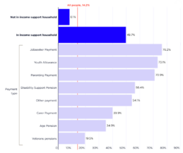
Poverty in households reliant on income support payments (% of all people in poverty)
2022-23 In 2022-23 there were 3,815,000 people (including children) in income support households, of whom 1,894,000 (50%) were in poverty. In the analysis below, we classify these households according to the highest income support payment received (for example, Jobseeker Payment or Age Pension). The highest poverty rates among people in income support households were for those relying on Jobseeker Payment (76% or 250,000 people), Youth Allowance (73% or 29,000) and Parenting Payment (71% or 204,000 people), followed by Disability Support Pension (56% or 362,000), Age Pension (35% or 574,000 people) and Carer Payment (40% or 106,000). 2019-20 This graph shows that poverty among people on working age income support payments fell sharply in the COVID recession. It shows that poverty among people in households on Jobseeker Payment fell by four-fifths, from 76% in 2019 to 15% in June 2020.
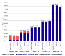
Average before-tax household income ($pw)
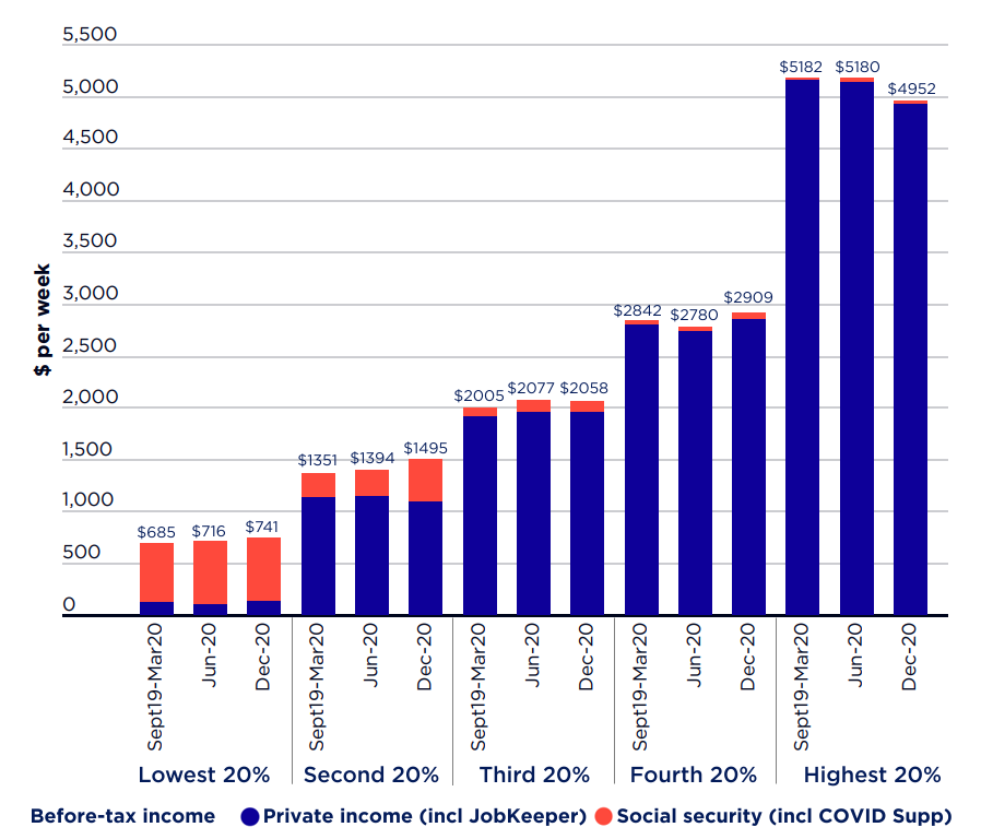 This chart shows trends in before-tax incomes for households ranked by private income from March 2020 (just prior to the COVID recession) to June 2020 (when Australia was locked down, and effective unemployment reached 17%) and December 2020 (when most lockdowns had eased and effective unemployment had declined to 7%).
It shows that, from March to December 2020, average before tax incomes:
* Rose from $685pw to $741pw for the lowest 20% of households ranked by income;
* Rose from $2,005pw to $2,058pw for the middle 20%;
* Fell from $5,182 pw to $4,952pw for the highest 20%.
These figures indicate that income inequality declined despite the recession, an extraordinary result given past experience
This chart shows trends in before-tax incomes for households ranked by private income from March 2020 (just prior to the COVID recession) to June 2020 (when Australia was locked down, and effective unemployment reached 17%) and December 2020 (when most lockdowns had eased and effective unemployment had declined to 7%).
It shows that, from March to December 2020, average before tax incomes:
* Rose from $685pw to $741pw for the lowest 20% of households ranked by income;
* Rose from $2,005pw to $2,058pw for the middle 20%;
* Fell from $5,182 pw to $4,952pw for the highest 20%.
These figures indicate that income inequality declined despite the recession, an extraordinary result given past experience
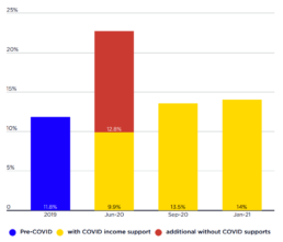
Poverty with and without COVID income supports
These graphs show the number and rate of people in poverty during the COVID recession and early stages of the recovery up to January 2021. They use the 50% of equivalent disposable household income, and the results have been adjusted to take account of housing costs, and shows the difference that the COVID income support payments (mainly Coronavirus Supplement and JobKeeper Payment) made to the number and rate of people in poverty. [infogram id="_/Qja04e8lBmpSwzbuh2jz" prefix="aPU" format="interactive" title="Figure 8a_Poverty with and without COVID income supports"] [infogram id="_/YuchlEUUjUwQrtYMpoCa" prefix="Twy" format="interactive" title="Figure 8b_poverty with and without COVID income supports (number of people)"] The graphs show that: * In June 2020, 9.9% of people were below the poverty line, compared with 11.8% in 2019 and 22.7% who would have been in poverty in June 2020 without the new income supports (Figure 8a). * An estimated 2,613,000 people were in poverty in June…
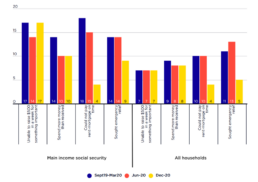
Financial stress among social security recipients and all people (2020)
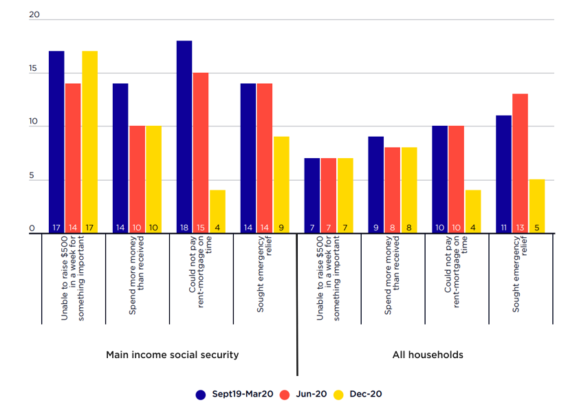 This graph shows trends in key financial stress indicators.
From September 2019 to December 2020:
* The proportion of people on social security unable to pay their rent or mortgage on time fell from 18% to 4%, while the proportion of the overall population fell from 10% to 4% (aided by rent and mortgage amnesties);
* The proportion of people on social security seeking emergency relief fell from 14% to 9% while the proportion of the overall population fell from 11% to 5%.
This graph shows trends in key financial stress indicators.
From September 2019 to December 2020:
* The proportion of people on social security unable to pay their rent or mortgage on time fell from 18% to 4%, while the proportion of the overall population fell from 10% to 4% (aided by rent and mortgage amnesties);
* The proportion of people on social security seeking emergency relief fell from 14% to 9% while the proportion of the overall population fell from 11% to 5%.
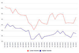
NAB financial stress index, 2014 to June 2021
[infogram id="_/7LbMYbStRHUZDOoryk8t" prefix="dOb" format="interactive" title="Figure 12_NAB financial stress index"] This graphs shows trends in the NAB financial stress index from 2014 to the June quarter of 2021. This measure of financial stress fell sharply in the second quarter of 2020, despite the recession. It then rose sharply in the first two quarters of 2021 among people on low incomes as COVID income supports were reduced and then removed.