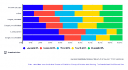
Income distribution of people by family type
This chart shows where people in different types of families are placed in the household income rankings. Single people are much more likely to be found in the lowest 20% income group, despite the fact that when people are divided into income groups, their household incomes are already adjusted to take account of family size (that is, the incomes of larger families are adjusted downwards - or ‘equivalised’ – to reflect their need for more income to attain the same living standard). Sole parent families are likely to be in the lowest 40% by income, reflecting lower employment rates and greater caring responsibilities, as well as the relatively low levels of social security payments. According to the Australian Bureau of Statistics, 51% of sole parents are employed compared with 73% of parents in partnered families with children. In contrast, there is a relatively high percentage of couples without children in the highest income group, likely due to higher earnings and lower financial…
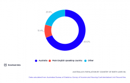
Australia’s population by country of birth
This shows that 69% of the population were born in Australia, 10% in a country where mainly English is spoken, and 21% were born elsewhere (in predominantly non-English speaking countries).
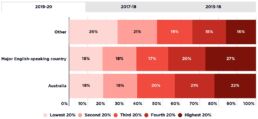
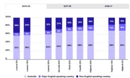
Income distribution by country of birth
This chart shows the composition of each income group by country of birth. People born in non-English speaking countries (other) are more likely to live in the lowest income group. One reason for this is that they come from less-wealthy countries, and another reason is that they are less likely to be approved to settle in Australia on the basis of workforce skills. Of those who entered Australia with permanent visas from 2006 to 2016, 62% of those coming from North-west Europe had skilled visas, compared with 49% of those from South-east Asia and 14% of those from North Africa and the Middle East. For more information, see Australian Bureau of Statistics (2016): Characteristics of Recent Migrants, Australia, November 2016. (‘Recent’ refers to those settling in Australia between 2006 and 2016). Conversely, people born in Australia or other mainly English-speaking countries are more likely to live in the highest 20% income group. 2019-20 Of adults born in a major English-speaking…
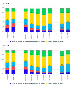
Profile of each income group by family type
This graph shows the make-up of each income group by family type. 2017-18: The graph shows that 42% of people in the lowest 20% income are single, either with or without children, compared with only 8% of those in the highest 20% income group. a majority of people in the lowest 20% income group are in couple families (55%). 2015-16: The graph shows that 32% of people in the lowest 20% income group are single, either with or without children, compared with only 8% of those in the highest 20% income group. A majority of people (57%) in the lowest 20% income group are in couple families, a reflection of their greater share (64%) of the overall population.
Profile of each income group by country of birth of adults
This chart shows the profile of each income group by the country of birth of adults within that group. A clear majority of people in all income groups were born in Australia, reflecting their high proportion (69%) of the overall population. 2019-20 Almost a third of (31%) of adults in the lowest 20% of incomes were born outside Australia in a country other than a major English-speaking country. 2017-18 29% of adults in the lowest 20% income group were born outside Australia in a non English-speaking country, while 69% of those in the highest 20% income group were born in Australia. 2015-16 Among those in the lowest 20% income group, 25% were born in a non English-speaking country. In contrast, 72% of those in the highest 20% were Australian born and only 15% were from non-English speaking countries.
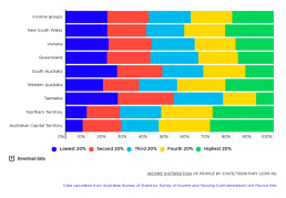
Income distribution of people by State/Territory
This graph shows where people living in different States and Territories are placed in the household income rankings. It shows that the States with the largest populations - New South Wales, Victoria and Queensland –have a more even representation of people across the income distribution than the smaller states and territories (the exception being the high share of people in the highest 20% - 23% - living in New South Wales, most of whom are likely to live in Sydney – link to graph). The smaller States and Territories have a greater concentration of people towards the highest or lowest ends of the income spectrum. For example, 25% of people living in Tasmania and South Australia are in the lowest 20% income group, while 23% of people in Western Australia and around 30% of people in the Territories are in the highest 20% income group. These interstate differences reflects differences in employment levels and age profiles of the populations living in each of the States and……
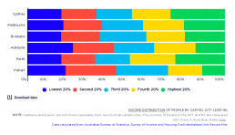
Income distribution of people by capital city
This graph shows where people living in different capital cities are placed in the household income rankings. People living in Sydney (28%) or Perth (25%) are more likely to be in the highest 20% income group. Conversely, residents of Adelaide (23%) were more likely to be found in the lowest 20% income group.
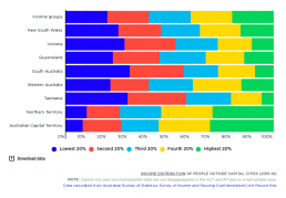
Income distribution of people outside capital cities
This graph shows where people living in different capital cities are placed in the household income rankings. The highest shares of non-metropolitan residents in the lowest 20% income group are found in South Australia (31%), Tasmania (30%) and Victoria (28%). Both the Australian Capital Territory (31%) and Northern Territory (30%) have relatively high shares of people in the highest 20%.
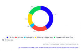
Australia’s population by labour force status
Almost two-thirds (62%) of Australia’s adult population are employed: the majority in full-time paid work (41%), but also a significant portion (21%) in part-time jobs. Just over one-third (34%) of the adult population are not in the labour force ( mainly younger and older people), while 4% of the total adult population (as distinct from the labour force) is unemployed.
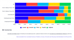
Income distribution of people in households by labour force status of household reference person
This graph shows where people are placed in the household income rankings, according to whether their household reference person (usually the member with the highest income) is employed, unemployed or not in the paid workforce. People in households where the reference person is either not in the labour force or unemployed are concentrated in the lowest 20% income group. Of all people in households where the reference person is unemployed, 77% are in the lowest 20%, along with 59% where the reference person is of working age but outside the paid workforce, and 42% where the reference person is 65 years or over and retired. On the other hand, 29% of people in households where the reference person is employed full-time are in the highest 20%. Living in a household where the reference person is employed part-time (meaning there is unlikely to be a full-time earner in the household) is no guarantee of a good household income. Of all people in these households, only 11% are found in the…