
Change in shares of overall wealth by wealth group
This shows changes in the shares of overall household wealth held by each wealth group. Between 2003-04 and 2017-18, the highest 20% wealth group increased its share of overall wealth by 4.5%, while the share of all other groups declined. This represents an unambiguous increase in wealth inequality over the period.
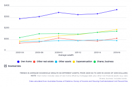
Trends in average household wealth in different assets
This shows compares the real value (after inflation is taken into account) of average wealth holdings in different assets. The average value of owner-occupied housing (the largest component of household wealth) rose strongly before the Global Financial Crisis, declined between 2009-10 and 2011-12, and then resumed its strong growth. Overall, the average value of owner-occupied housing rose by 28% (after inflation) during this period. The value of other real estate (investment property) followed a similar pattern. But grew much more strongly overall, by 61%. The average value of superannuation holdings grew very strongly and consistently across the period (by 119% overall), so that its share of wealth holdings increased. From 2003-04 to 2015-16, the share of owner-occupied housing in all household wealth fell from 45% to 39%, though it remained the largest component. The share of wealth in superannuation rose from 14% to 20% (reflecting the gradual maturing of the superannuation…
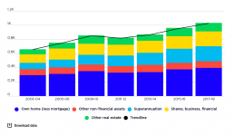
Trends in the concentration of wealth in different assets, from 2003-04 to 2017-18
From 2003-04 to 2017-18, the overall value of household wealth rose by 56% after inflation, led by strong growth in the value of superannuation, shares and other financial investments, and investment property. In that time, the average value of superannuation held by households (including those who do not have it) rose by 141% from $89,000 to $214,000, shares and other financial assets rose by 74% from $121,000 to $210,000 and investment property rose by 66% from $71,000 to $119,000. The average value of the largest asset - owner-occupied housing - grew at a more modest 35% from $294,000 in 2003 to $398,000 in 2017, along with 8% growth in the value of other non-financial assets from $86,000 to $92,000.
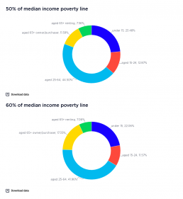
Profile of poverty by age (% of people in poverty)
These graphs show the the number of people living in poverty divided by age groups, by 50% and 60% median income poverty lines, in 2017-18 and 2015-16. 2017-18 The largest age group below the poverty line is those of working age (35-64 years), at 45% of all people in poverty (43% using the 60% of median income poverty line). This reflects their high share (53%) of the overall population. 2015-16 The largest group below the poverty line was those of working age (25-64 years), at 48.1% of all people in poverty (43.7% using the 60% median income poverty line) reflecting their high share (53%) of the overall population.
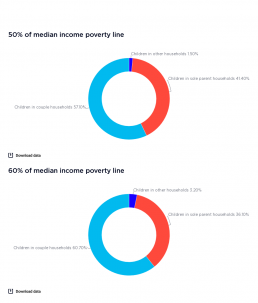
Profile of poverty among children
These graphs display the number of children living in poverty, divided by household type, by 50% and 60% median income poverty lines, for 2017-18 and 2015-16. 2017-18 This graph shows that most children in poverrty live in couple households (57.1% based on the 50% median income poverty line, and 60.7% based on the 60% median income poverty line). This is because the vast majority of children (82%) live in couple households. However, children in sole parent households are over-represented, at 41.4% and 36.1% of all children in poverty. 2015-16 This graph displays the number of children living in poverty, divided into their household type. It shows that most children in poverty live in couple households (61% based on 50% of median income poverty line, and 63% based on the 60% poverty line). This is because the vast majority of children (83%) live in couple households. However, children in sole parent households are over-represented, at 38% and 34% of all children in poverty.
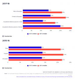
Rate of poverty by gender (% of men and women)
This graph shows the rate of poverty among all people by gender. It shows that people identifying as female are more likely to live in households below the poverty line than those identifying as male, no matter which poverty line is used. Because this website focuses on household incomes, the gap between male and female poverty rates is much less than the gender gap in personal incomes. 2017-18: Women are more likely to live in households below the poverty line than men (14.1% for women and 13.1% for men, using the 50% median income poverty line). The poverty rate for households with a female reference person or main earner is almost twice as high (19.2% using the 50% median income poverty line) as when the main earner is male (10.2% using the 50% median income poverty line). When the 60% of median income pvoerty line is ued, the poverty rates are 28.4% and 16.5% respectively. 2015-16: This graph shows hows that women are more likely to live in households below the poverty line than…
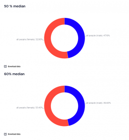
Profile of poverty by gender
These graphs show the number of people living in poverty divided into binary gender groups according to the 50% and 60% median income poverty lines in 2015-16 and 2017-18. Because this website focuses on household incomes, the gap between male and female poverty rates is much less than the gender gap in personal incomes. 2017-18 This graph shows that a higher share of people in poverty are female – 42.9% compared with 47.1% based on the 50% of median income poverty line, or 53.4% compared with 46.6% using the 60% of median income poverty line. 2015-16 This graph shows that a higher share of people in poverty were female – 51.5% compared with 48.5% based on the 50% of median income poverty line, or 51.9% compared with 48.1% using the 60% of median income poverty line.
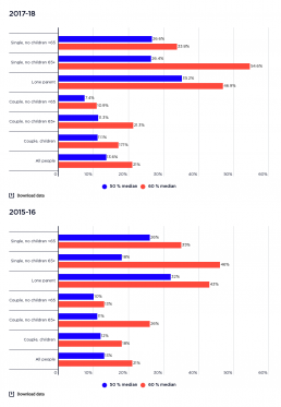
Rate of poverty by family type
This graph shows the rate of poverty for all people by family type. 2017-18: This shows that the family type with the highest rate of poverty is sole parent families – 35.2% based on the 50% of median income poverty line and 46.9% based on the 60% of median income poverty line. Single persons living alone also have relatively high poverty rates, which reflects their limited opportunity to benefit from economies of scale in living costs and reliance on a single income. When the 50% poverty line is used, single adults under 65 years have a higher rate of poverty (26.6%) than those 65 years and older (26.4%), but these rankings are reversed when the 60% poverty line is used (33.4% compared with 54.6%). 2015-16: This shows that the family type with the highest rate of poverty is sole parent families – 32% based on the 50% of median income poverty line and 43% based on the 60% of median income poverty line. Single persons living alone also have relatively high poverty rates, which…
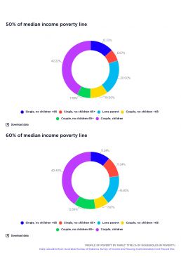
Profile of poverty by family type (% of households in poverty)
These graphs display the number of people already living in poverty, divided into household groups by 50% median income and 60% median income poverty lines, firstly in 2017-18 and then in 2015-16. 2017-18 This shows that couple households with children, due to their larger share of the overall population, are the largest group in poverty, at 33.9% using the 50% of median income poverty line and 33.7% using the 60% of median income poverty line. Sole parent families are strongly over-represented among those in poverty, at 18% using the 50% median income poverty line and 15.5% using the 60% median income poverty line. 2015-16 This shows that couple households with children, due to their larger share of the overall population, were the largest group in poverty, at 42% using the 50% of median income poverty line and 41% using the 60% of median income poverty line. Sole parent families were strongly over-represented among those in poverty, at 20% using the 50% median income poverty line…
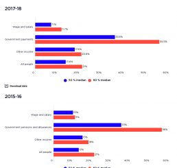
Rate of poverty by main income source
This graph shows the rate of poverty in households by their main income source. It shows that households relying mainly on social security payments are approximately five times more likely to experience poverty than those relying mainly on wages and salaries. 2017-18: Those relying on social security payments represent 36% using the 50% of median income poverty line and 56% using the 60% of median income poverty line, whilst those relying mainly on wages and salary represent 7% using the 50% of median income poverty line and 12% using the 60% of median income poverty line. 2015-16: Those relying on social security payments represent 35% using the 50% of median income poverty line and 56% using the 60% of median income poverty line, whilst those relying mainly on wages and salary represent 7% using the 50% of median income poverty line and 12% using the 60% of median income poverty line.