
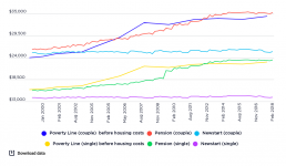
Comparison of poverty lines with pension and Newstart (now JobSeeker) payments for singles and couples without children (in $2017-18 per annum)
[infogram id="_/Z6uPcuCsRqxPeqAgNifT" prefix="jSE" format="interactive" title="Comparison of poverty lines with pension and Newstart payments for singles and couples without children"] Social security policies clearly have an impact on poverty, for better or for worse. Because most major income support payments are below the poverty line, in order to escape poverty people need to supplement or replace them with private income from other sources. This graph compares trends in maximum pension and Newstart Allowance rates and poverty lines from 1999-00 to 2017-2018. It shows that while Newstart Allowance for singles was consistently well below the poverty line, it was above the line for couples up until 2004. This reflects an historical legacy: unlike payments for singles, unemployment payments for couples were tied to the pension rate until 1998. In contrast, pension rates for both singles and couples have closely tracked poverty lines. One reason for this is that pensions are indexed…
Income support policy and poverty trends
Presentation to the Australian Social Policy Conference, September 2019, by Bruce Bradbury, Social Policy Research Centre, UNSW Sydney: Income support policy and poverty trends in 21st century Australia
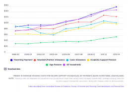
Trends in housing costs by income support payment
[infogram id="_/2XsC1YPVaUyhuszpLYzT" prefix="jmQ" format="interactive" title="Fig.44_ Trends in average housing costs for income support households, by payment ($2015-16 per week, equivalised)"] This graph shows trends in average housing costs (adjusted for household size) for households reliant on income support payments, by payment, using $2015-16, compared with the median cost for all households. From 2006-08 to 2015-16, median housing costs for all households (after adjusting for inflation and household size) rose from $75 a week in 1999-00 to $115 a week in 2007-08, and then increased by 27% to $146 in 2015-16. The largest housing cost increases from 2007-08 to 2015-16 were experienced by those relying on Parenting Payment (mainly sole parent families). Their average housing costs rose in real terms from $91 per week in 1999-00 to $115 in 2007-08, then increased again by 32% to $152 in 2015-16. Those relying mainly on Newstart Allowance also faced relatively high housing costs,…
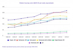
Median equivalised housing costs by family type and age (1999-2015)
[infogram id="_/nUICqfwLw4fKjydspymI" prefix="aBM" format="interactive" title="Fig.43_Median equivalised housing costs by family type and age (1999-2015)"]
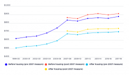
Trends in household disposable incomes, 1999-00 to 2017-18
[infogram id="_/7dEOcr850NkhjjFshX6c" prefix="nvo" format="interactive" title="Trends in median household disposable incomes, before and after deducting housing costs"] This graph shows trends in median household incomes from 1999-00 to 2017-18, adjusted for inflation using 2017-18 dollars. Because the poverty lines used in this website are benchmarked against median equivalent household disposable income, major changes in this income affects measured poverty levels. This graph shows that median household disposable incomes rose sharply from 1999-00 to the Global Financial Crisis of 2007-08, and thereafter grew much more slowly. This reflects the economic boom conditions from before the Global Financial Crisis, and the sluggish growth afterwards.
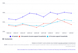
Trends in poverty gaps among people in sole parent income support households
[infogram id="_/ZJBPu8Y0JSUJkcCpRBEP" prefix="lFw" format="interactive" title="Fig.41_Average poverty gaps among people in sole parent income support households"] This graph compares poverty gaps (the difference between the average incomes of those below the poverty line and the poverty line) for sole parents in income support households with firstly those for all people in income support households, and, secondly, the whole population living below the poverty line. Generally, the poverty gaps for sole parents in income support households are very similar to those in income support households generally, reflecting the fact that the maximum rate of Parenting Payment Single is greater than Newstart and other allowance payments, but less than pension payments. The poverty gap for sole parents in income support households rose from 28% of the poverty line in 1999-00 to 45% in 2011, then declined to 29% in 2015-16.
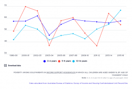
Trends in poverty among sole parents in income support households
[infogram id="_/R5BkHbKpmDvtuYNqfCmw" prefix="wcB" format="interactive" title="Fig.40_ Poverty among sole parents in income support households in which all children are under 16 years"] This graph shows the poverty rate among sole parents in income support households in which all children are aged under 15 as a percentage of all households, taking into account housing costs. By only including households with children under the age of 15, it controls for the earnings of teenage and adult children. While the poverty rate among families with a youngest child aged 0-4 years remained stable, rising only marginally from 57% in 2011-12 to 58% in 2012-13, poverty rates rose substantially among families whose youngest child was 5-9 years old, from 47% to 55%; and for those whose youngest child was 10-14 years old, from 51% to 67%. This reflects the impact of the introduction of ‘welfare to work’ policies, and the movement of sole parents from pension payments to lower allowance payments.
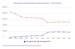
Trends in sole parents receiving different payments
[infogram id="_/c7ZlcCuzX2HMpJKlL1lZ" prefix="pOu" format="interactive" title="Fig.39_Sole parents on Parenting Payment Single and Newstart/Youth Allowance"] This graph shows the trends in the number of sole parents receiving Newstart Allowance and the number of sole parents receiving Parenting Payment Single. The number of sole parents receiving Parenting Payment declined from 425,000 in 2006 to 260,000 in 2015, with the largest reduction being the fall from 320,000 to 250,000 in 2013 when the last remaining sole parents with a youngest child aged 8 or more (those who had received Parenting Payment before 2006) were shifted on to Newstart Allowance or other payments, or else stopped receiving income support payments. The number of sole parents receiving Newstart Allowance rose from close to zero in 2006 to 88,000 in 2015.
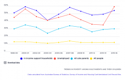
Trends in poverty among sole parents
[infogram id="_/mRM6RO5nv3qfszuSD77a" prefix="PJ9" format="interactive" title="Fig.38_Trends in poverty among sole parents and their children"] This graph displays the trends in poverty among sole parents, based on the 50% median income poverty line and as a percentage of all people in sole parent families, taking into account housing costs. It shows that sole parents had consistently higher poverty rates than the population-wide level throughout the period. The rate fluctuates in a ragged style, falling from 31% in 1999-00 to 25% in 2002-03, rising to 46% in 2007-08, falling to 26% in 2011-12, then rising again to 30% in 2016-17. This pattern can be partially explained by changes in median household incomes and housing costs for sole parents. The poverty rate among sole parents in income support households (relying primarily on either Parenting Payment or Newstart Allowance) followed a similar ragged pattern but at higher levels. This is due to a large number of sole parents living…