
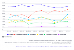
Trends in poverty among unemployed people
[infogram id="_/KXnJvdEXP8NyP0r9keE0" prefix="SrF" format="interactive" title="Fig.37_ Trends in poverty among unemployed people, by family type and payment"] This graph displays trends in poverty among people without paid work, by family type and payment according to the 50% median income poverty line and as a percentage of all unemployed people, taking into account the cost of housing. It shows that poverty among unemployed people was consistently higher than the population-wide poverty rate from 1999-00 to 2015-16. The poverty rate among unemployed single people was particularly high, at 90% at both the beginning and end of this period, reflecting the level of Newstart and Youth Allowances. Recipients of Newstart Allowance also had elevated poverty rates, albeit lower than those for single unemployed people. The differences between the two groups is family status (Newstart recipients includes those who are partnered) and employment status (approximately 1 in 5 Newstart recipients…
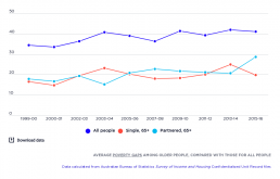
Trends in poverty gaps among older people
[infogram id="_/Uc9iA6ICz7j1WLtLMZC1" prefix="Rq9" format="interactive" title="Fig.36_ Average poverty gaps among older people, compared with those for all people"] This graph shows that the average poverty gaps (the difference between the average incomes of those below the poverty line and the poverty line) among people aged 65+ in income support households were much lower than those across the whole population between 1999-00 and 2015-16. This is explained by the proximity between pension payments and the poverty line. However, the poverty gap for older couples in income support households rose over the period, from 18% of the after-housing poverty line in 2003-04 to a peak of 29% in 2015-16, probably reflecting increases in housing costs.
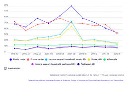
Trends in poverty among older people
[infogram id="_/KrlBnBaPGml5wTuj0Pju" prefix="UgG" format="interactive" title="Fig.35_ Trends in poverty among older people, by family type and housing status"] This graph compares the before housing poverty rates for single older people after housing costs are taken into account, based on the 50% median income poverty line. It shows that until 2015, single people aged 65+ had significantly higher poverty rates than the wider community, whilst poverty rates for couples aged 65+ have been consistently lower. Poverty rates for older people in income support households (mainly Age Pension recipients) were slightly higher than rates for older single and partnered people generally, and followed similar lines. One of the noticeable features of this graph is the different trend in poverty among older single people and couples between 2005-06 and 2009-10. The poverty rate for older couples was relatively stable, declining from 9.2% in 2005-06 to 8.4% in 2009-10, while poverty rose for single…
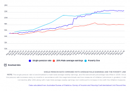
Trends in single pension rate and poverty line
[infogram id="_/VEE1BBaH2pYicFIrMrPH" prefix="Q69" format="interactive" title="Fig.34_ Single pension rate compared with average male earnings and poverty line"] This graph compares the single pension rate with average male earnings and the 50% median income poverty line before housing costs are taken into account. The result of the closeness between these means that large numbers of pension recipients can move from one side of the poverty line to the other.

Average poverty gaps among people in income support households
[infogram id="_/IkwHZ86ROPGecCFJvaN6" prefix="VjF" format="interactive" title="Fig.32_Average poverty gaps among people in income support households"] This graph shows trends in poverty gaps for households in which at least one member receives a substantial income support payment, expressed in constant 2015-16 dollars per week, adjusted for household size. It shows that poverty gaps for households relying on Newstart Allowance rose in several increments over the period, from $81 per week in 1999-00 to $136 per week in 2015-16. Poverty gaps for households relying on Age Pension and Disability Support Pension moved in more narrow fashion. The poverty gap for those relying on Age Pension rose from $52 a week in 1999-00 to $77 a week in 2015-16, while for those relying on Disability Support Pension the gap rose from $59 per week in 1999-00 to $73 per week in 2015-16. The poverty gaps for households relying on Parenting Payment fell from $70 a week in 1999-00 to $67 a week in 2004-05, then…
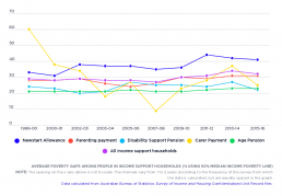
Average poverty gaps among people in income support households by percentage
[infogram id="_/eXUxttoE2BxuusHvz5uR" prefix="YgN" format="interactive" title="Fig.31_ Average poverty gaps among people in income support households"] This graph shows trends in poverty gaps for households in which at least one member receives a substantial income support payment (an income-tested payment for adults such as Newstart Allowance or Age Pension, as distinct from a supplementary payment such as Family Tax Benefit), expressed as a percentage of the 50% median income poverty line. It shows that poverty gaps for households relying on Newstart Allowance rose in several increments over the period, from 33% in 1999-00 to 41% in 2015-16. Poverty gaps for households relying on Age Pension and Disability Support Pension moved in more narrow fashion.

Trends in poverty rates by income support payment
[infogram id="_/woq9aQjxy1IrHiyjIHw8" prefix="4oK" format="interactive" title="Fig.30_Trends in poverty rates among people in income support households, by payment"] This graph compares poverty rates among households in which at least one member receives a substantial income support payment (an income-tested payment for adults such as Newstart Allowance or Age Pension, as distinct from a supplementary payment such as Family Tax Benefit). Poverty rates for those receiving Newstart Allowance and Parenting Payment were consistently above the average, whilst the poverty rate for the Age Pension was consistently below average. The difference in poverty rates between these payments has increased since the Global Financial Crisis of 2007-08. Poverty in income support households reliant on Newstart Alllowance declined from 61% in 1999-00 to 48% in 2003, and then rose in zigzag fashion to 78% in 2015-16. Among income support households reliant on most pension payments (Age Pension, Disability…
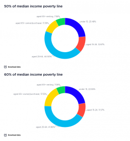
Profile of poverty by age (% of people in poverty)
These graphs show the the number of people living in poverty divided by age groups, by 50% and 60% median income poverty lines, in 2017-18 and 2015-16. 2017-18 [infogram id="_/ATEfU7NryM7szv7BGHdo" prefix="5lM" format="interactive" title="2017-18-Fig.6_Profile of poverty by age (% of people in poverty)"]The largest age group below the poverty line is those of working age (35-64 years), at 45% of all people in poverty (43% using the 60% of median income poverty line). This reflects their high share (53%) of the overall population. 2015-16 [infogram id="_/nAZjADxtYH9F89wRt28j" prefix="uaZ" format="interactive" title="2015-16: Profile of poverty by age (% of people in poverty) 50% median income poverty line"]The largest group below the poverty line was those of working age (25-64 years), at 48.1% of all people in poverty (43.7% using the 60% median income poverty line) reflecting their high share (53%) of the overall population.
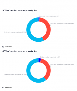
Profile of poverty among children
These graphs display the number of children living in poverty, divided by household type, by 50% and 60% median income poverty lines, for 2017-18 and 2015-16. 2017-18 [infogram id="_/0GvApnjb2OLcOnaoBYEf" prefix="HhL" format="interactive" title="2017-18:Fig 4_Profile of poverty among children up to 15 years (% of children in poverty)"] This graph shows that most children in poverrty live in couple households (57.1% based on the 50% median income poverty line, and 60.7% based on the 60% median income poverty line). This is because the vast majority of children (82%) live in couple households. However, children in sole parent households are over-represented, at 41.4% and 36.1% of all children in poverty. 2015-16 [infogram id="_/UWUSjQyPN7JjNVwxCPQX" prefix="HXX" format="interactive" title="Fig.8_Profile of poverty among children up to 15 years (% of children in poverty)"] This graph displays the number of children living in poverty, divided into their household type. It shows that most…
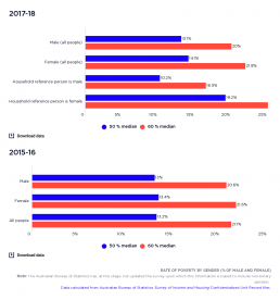
Rate of poverty by gender (% of men and women)
This graph shows the rate of poverty among all people by gender. It shows that people identifying as female are more likely to live in households below the poverty line than those identifying as male, no matter which poverty line is used. Because this website focuses on household incomes, the gap between male and female poverty rates is much less than the gender gap in personal incomes. [infogram id="_/igrKGLKtUyXkvh7lkR1g" prefix="yQ0" format="interactive" title="2017-18: Fig.9_Rate of poverty by gender (% of men and women)"] 2017-18: Women are more likely to live in households below the poverty line than men (14.1% for women and 13.1% for men, using the 50% median income poverty line). The poverty rate for households with a female reference person or main earner is almost twice as high (19.2% using the 50% median income poverty line) as when the main earner is male (10.2% using the 50% median income poverty line). When the 60% of median income pvoerty line is ued, the poverty rates…