
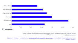
Poverty rates among Aboriginal and Torres Strait Islander people, by region, in 2016
[infogram id="_/R8EZUhNv2j3m3WB91rIf" prefix="I3b" format="interactive" title="Fig.28_Poverty rates among Aboriginal and Torres Strait Islander people, by region, in 2016"] This graph shows that the poverty rate for Aboriginal and Torres Strait Islander people is 31%, and that poverty amongst Aboriginal and Torres Strait Islander people is twice as high in very remote communities (54%) as in major cities (24%). However, it must be noted that accurate measurement of poverty is in these communities is hampered by non-declaration of income and the complexity of family structures and income-sharing arrangements, all of which likely result in under-estimation of poverty in Aboriginal and Torres Strait Islander communities.
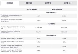
People in poverty & poverty gaps
This table shows the number and percentage of people who live below the 50% and 60% of median income poverty lines in 2022-23, the latest data available, as well as previously in 2019-20, 2017-18 and 2015-16. It also shows the ‘poverty gap’, a measure of the depth of poverty for those living below the poverty line (the average gap between the incomes of people in poverty and the poverty line). It is important to measure poverty gaps, because even if the rate of poverty is reduced, this could still leave many people living well below the poverty line. 2022-23: After taking account of housing costs, over one in seven people (14.2%) live below the 50% of median income poverty line. The poverty rate among children is higher, over one in six children (15.6%). There are 3,706,244 people living in poverty in Australia. This figure includes 756,734 children. The ‘poverty gap’ is 47% of the poverty line, or $390 a week. That is, people below the poverty line have incomes that are, on…
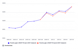
Trends in the poverty gap
[infogram id="_/GJCBZ2rBedXw2stcKEdp" prefix="YZv" format="interactive" title="Average poverty gap for all households in poverty"] This graph shows the average poverty gap for all people living below the poverty line, in dollars per week. These figures are indexed for inflation and are expressed in constant 2017-18 values. They are not adjusted for household size, so the average poverty gaps are boosted by the bigger gaps for larger households. It shows that average poverty gaps increased after 2007.
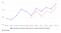
Trends in the poverty gap as a percentage of poverty line, 1999-00 to 2017-18
[infogram id="_/bBTK9obiKJ9ZQFca9x73" prefix="ZiW" format="interactive" title="Copy: Fig.3_ Average poverty gap for all households in poverty (% of the poverty line, after housing, 2017-18"] This graph measures the poverty gap (the average gap between the household incomes of those in poverty and the poverty line) as a percentage of the poverty line. It shows that the average gap between the household incomes of those in poverty and the poverty line rose from 34.3% of the poverty line in 1999-00 to 40.8% in 2003, fell in the boom years to 36.3% in 2007-08, then rose in sawtooth fashion to 44.2% in 2017-18. Broadly speaking, this is the opposite pattern to the trends in poverty rates. This reflects the changing composition of households below the poverty line. For example, a growing number of older people fell below the poverty line during the boom years from 2003 to 2007, but (relative to others in poverty such as people on Newstart Allowance) their average incomes were not as far…
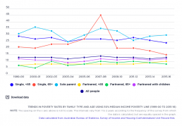
Trends in poverty rates by family type and age
[infogram id="_/U99pdeoM464V71vRaQNp" prefix="LT8" format="interactive" title="Fig.29_Trends in poverty rates by family type and age (1999-2015)"] This graph compares trends in poverty according to family type and age, between 1999-00 – 2015-16. It shows that, over this period, poverty rates were consistently higher for single people and sole parents than for partnered families. It also shows that poverty rates for people aged 65 and more, and for sole parents, were more variable than for other family types. The main shifts over the period are a decline in poverty among single people aged 65 and over; and a rise in poverty among partnered people, no matter their age. Poverty rates for single people fluctuated considerably more than for partnered people, especially for single people aged 65 and over, in part reflective of the closeness of single pension rates to the 50% median income poverty line.
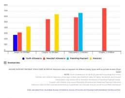
Comparison of income support payment rates and poverty lines
[infogram id="_/I3NcQQUxo5RWbDHkGtCa" prefix="fnx" format="interactive" title="Fig.17_Social security payment structure in 2015-16: maximum rates of payment for different family types with no private income ($ per week)."] Government payments in Australia include income support payments for adults in low income households (divided into the higher pension payments such as Age Pension and lower allowance payments such as Newstart Allowance), Family Tax Benefits for children in low and middle-income families, and supplementary payments such as Rent Assistance for private tenants in low-income households. This graph illustrates the rate structure that applied in 2015-16.
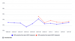
Trends in poverty, all people, 1999-00 to 2017-18
[infogram id="_/ypSowuzIsLYD4473YkFl" prefix="Qaz" format="interactive" title="Percentage of all people in poverty from 1999 - 2017"] This graph shows the poverty rates, after housing costs have been deducted, as a percentage of all people from 1999-00 to 2017-18. Whilst we focus on the consistent estimates based on the pre-2007 measure by the ABS (lower line), this graph also includes the higher poverty rates derived from the 2007-08 ABS income measure (upper line). The graph shows how the overall poverty rate fluctuated within a band between 11.5% and 14.5% between 1999-00 and 2017-18. Poverty declined substantially from 13.1% in 1999 to 11.5% in 2003, rose sharply during the boom years to 14.4% just before the Global Financial Crisis (GFC) in 2007, declined to 12.6% in 2009, and since then has risen modestly to 13.1% in 2017-18.
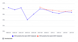
Trends in poverty - children, 1999-00 to 2017-18
[infogram id="_/B9ifB7d9gPDfd9ow2T4i" prefix="qAf" format="interactive" title="Percentage of all children in poverty from 1999-2017"] This graph shows the poverty rate amongst children, after housing costs have been deducted, as a percentage of all children. It shows that poverty among children (people aged under 15 years) has moved within a higher band than overall poverty, fluctuating between 14.3% and 18.6% from 1999-00 to 2017-18. Before the Global Financial Crisis (GFC) in 2007, it followed a similar path to the overall poverty rate, declining substantially from 18.6% in 1999-00 to 14.3% in 2003-04, and rising sharply between from 2003-04 to 18.1% in 2001-02. After the GFC, however, the path of child poverty diverged from that of overall poverty. It fell only slightly to 17.8% in 2009-10, declined further to 16.5% in 2013-14, then rose to 16.9% in 2017-18
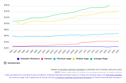
Trends in income support payments compared with wages
[infogram id="_/oPpZqcAZ5xL6HtnhQS4R" prefix="HCT" format="interactive" title="Fig.33_Trends in social security payments compared with wages"] This graph compares the single maximum rate of Newstart Allowance and pension payments with wages, represented by the minimum wage, average weekly full-time earnings and the median full-time wage, in 2018 dollars. It shows that the gap between the Newstart Allowance and single pension rates, as well as average and median wages, has grown over time.
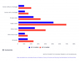
Rate of poverty by housing tenure
This graph shows the poverty rate of people by housing tenure –whether they own the house with or without a mortgage; whether they rent either privately or publicly; or whether they have another form of occupation type. [infogram id="f19172d1-0da4-4a73-a103-b6ef74bda4e3" prefix="d65" format="interactive" title="Fig.24_Rate of poverty by housing tenure (% of households)"] 2017-18: The graph shows that the risk of poverty is twice as great (19% using 50% median income poverty line and 28% using 60% median income poverty ine) for people in households renting privately than for home-owners (9% using 50% median income poverty line or 19% using median income poverty line) or home purchasers (9% using 50% median income poverty line or 13% using median income poverty line), reflecting the higher cost and/or lower incomes of people in private rental housing. 2015-16: The graph shows that households who rent privately have twice has much risk of poverty (at 21% using 50% median income poverty…