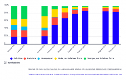
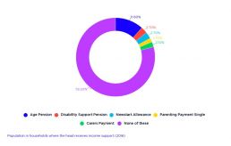
Profile of each income group by labour force status of household reference person
This graph shows the make-up of each income group according to whether their household reference person (usually the member with the highest income) is employed, unemployed or not in the paid workforce. Household members whose reference person is unemployed form a larger share of income groups as we move down the income scale. They represent 7% of the lowest 20% income group; 10% of the lowest 10% income group, and 13% of the lowest 5% income group. This is echoed in households where the reference person is of working age and is not part of the paid workforce, which comprise 28% of the lowest 20% income group, 34% of the lowest 10% income group, and 35% of the lowest 5% income group. The lowest 20% income group mainly comprises households where the reference person is out of the paid workforce: 30% where the reference person is over 64 and 28% where they are of working age. Another 20% are employed full-time, 16% are employed part-time, and the remaining 7% are unemployed. In…
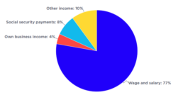
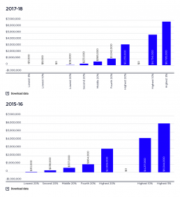
Population by main source of household income
This chart shows the main sources of household income in Australia. 2019-20: Wages and salaries were the largest income source (77% of all income), followed by investment and other income (10%), social security payments, including Family Tax Benefits (8%), and own-business income (4%). 2017-18: The main source of household income is wages and salaries, at 75%. Of the remainder, 8% are social security payments, 5% self employed and 12% from other sources (mainly investments). 2015-16: For most people in Australia, the main source of household income is wages and salaries, at 69%. Of the remainder, 18% are in households relying mainly on social security payments, 5% on income from self-employment and 8% from other sources (mainly investments).
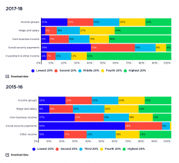
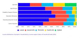
Income distribution of people in households by main income source
This graph shows where people are placed in the household income rankings, according to their household’s main source of income in 2015-16 and 2017-18. Social security payments include pensions, allowances and family payments. 2017-18: The graph shows that the highest 20% income group receives two-thirds of all investment income and a substantial share of own-business income and wages (48% and 44% respectively). At the other end of the scale, the lowest 20% receives over a third of all social security income (38%). 2015-16: The graph shows that 65% of people in households that mainly rely on social security payments are concentrated in the lowest 20% income group. In contrast, people in households relying mainly on wages or salaries are more likely to be found at the higher end of the distribution (with 51% in the highest 40% income group). Households whose main income is from an unincorporated business are more likely (27%) to belong to the lowest 20% income group. It should be…
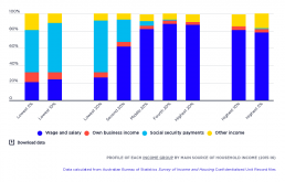
Profile of each income group by main source of household income
This graph shows the make-up of each income group according to their household’s main source of income. The majority (60%) of people in the lowest 20% income group live in households where the main income is social security payments. However, 40% of people in that income group live in households relying mainly on other income sources, including wages (26%), own business income (6%) and ‘other income’, mainly investments (8%). Towards the higher end of the income scale, 87% of those in the highest 20% income group are in households relying mainly on earnings, and none are in households relying mainly on social security. However, even higher up the scale an increasing share of people live in households rely mainly on investment income – from 9% of the highest 20% income group, to 14% of the highest 10% income group, and 17% of the highest 5% income group.
Average net wealth, by wealth group
This graph shows the distribution of wealth by wealth groups. Wealth is distributed much less broadly than income 2017-18: The average wealth of the highest 20% wealth group is $3,255,000, more than six times that of the middle 20% who had $565,000; and over 90 times that of the lowest 20%, who had $36,000. The average wealth of the highest 5% is $6,795,000. 2015-16: The highest 20% wealth group had average wealth holdings of $2.9 million, more than five times that of the middle 20% wealth group ($537,000) and almost 100 times the $30,000 held by the lowest 20% wealth group.
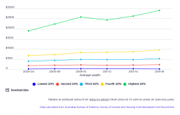
Trends in average wealth by wealth group
This shows changes in the 'real value' (after inflation) of net household wealth. Wealth inequality increased more sharply than income inequality between 2003-04 and 2015-16. Click here to see the income inequality trends. The average wealth of the highest 20% wealth group rose from $1.9 million in 2003-04 to $2.6 million in 2009-10, declined to $2.4 million in 2011-12 (after the Global Financial Crisis) and rose again to $2.9 million in 2015-16. Trends in the value of wealth holdings of the remaining 80% changed much less in comparison.
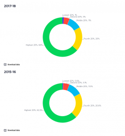
Shares of national wealth by wealth group
This graph shows how wealth is divided up among households. This probably underestimates of the true extent of wealth inequality. The wealthiest 1%, who own a disproportionate share of all wealth, are a small number of people and so are underrepresented in household surveys. It is also likely that many under-report their wealth. See the pie chart showing shares of income by income group. 2017-18: The wealthiest 20% holds 64% of all wealth, followed by 20% for the next wealthiest group. The remaining 60% of households have just 17% of wealth between them. 2015-16: The highest 20% of household wealth groups holds 62% of all wealth. The middle 20% wealth group holds 12%, and the lowest 20% wealth group holds less than 1%. Wealth is highly concentrated at the very top. The highest 10% wealth group owns 45% of all wealth while the highest 5% owns 32% and the very highest 1% holds 15%. So the share of the highest 1% (15%) is greater than the middle 20% (12%). In contrast, the combined…
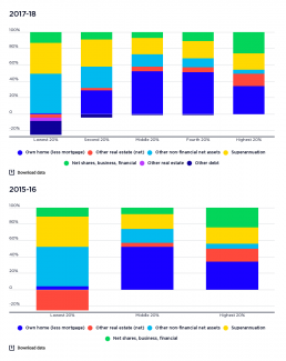
Profile of wealth holdings of wealth groups
This graph shows the components of wealth for each wealth group. The profile of assets held changes as we move up the household wealth scale. 2017-18: The holdings of the lowest 20% wealth group are mainly in 'other non-financial assets' such as cars (48% of heir wealth holdings) and superannuation (38%). Few own their homes. Moving up, the proportion of wealth held in owner-occupied housing rises (from 29% for the second-lowest wealth group to 51% for the second-highest). The proportion held in superannuation declines from 33% to 21%. In the highest wealth group, relatively less of the wealth is in the main home (34%) than those in the middle, and more of it in shares and other financial investment (26%) and investment property (15%). 2015-16: Most of the wealth of the lowest 20% wealth group is in low-value assets such as cars and home contents (49%) and superannuation (40%). The average net value of owner-occupied housing held by this group is just $2,000, which strongly suggests…